SYS.LOAD 0x4F2A IDX_03

Juliette Davis is a French-American graphic designer based in Bristol, UK, working across print and digital media. Her practice is rooted in research, using systems, mapping, and editorial structures to examine how environments are organised and perceived. Her work often focuses on overlooked subjects, from natural landscapes to infrastructure, approached through a precise, observational lens.

For inquiries, collaborations, or just to say hello, get in touch via email.

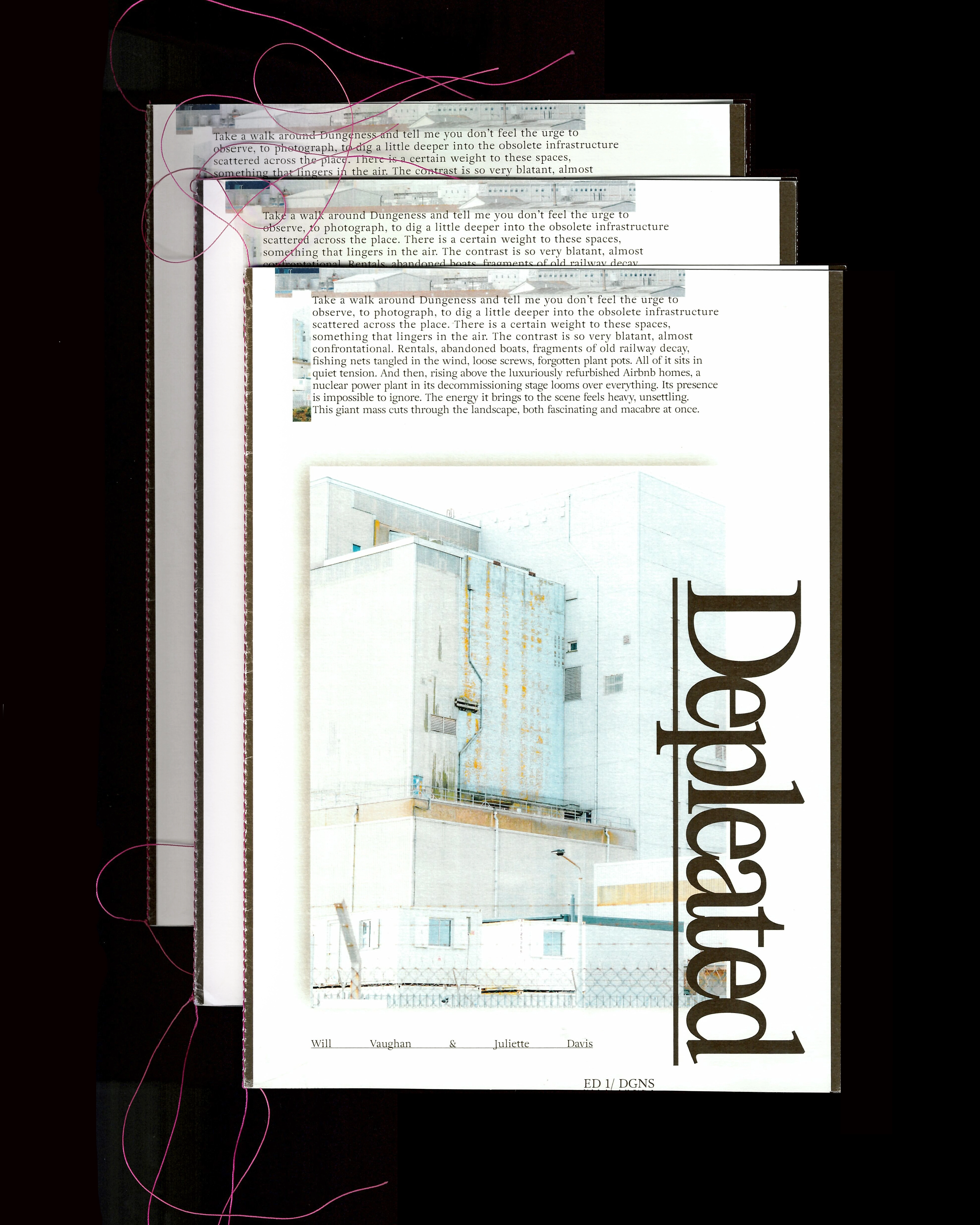
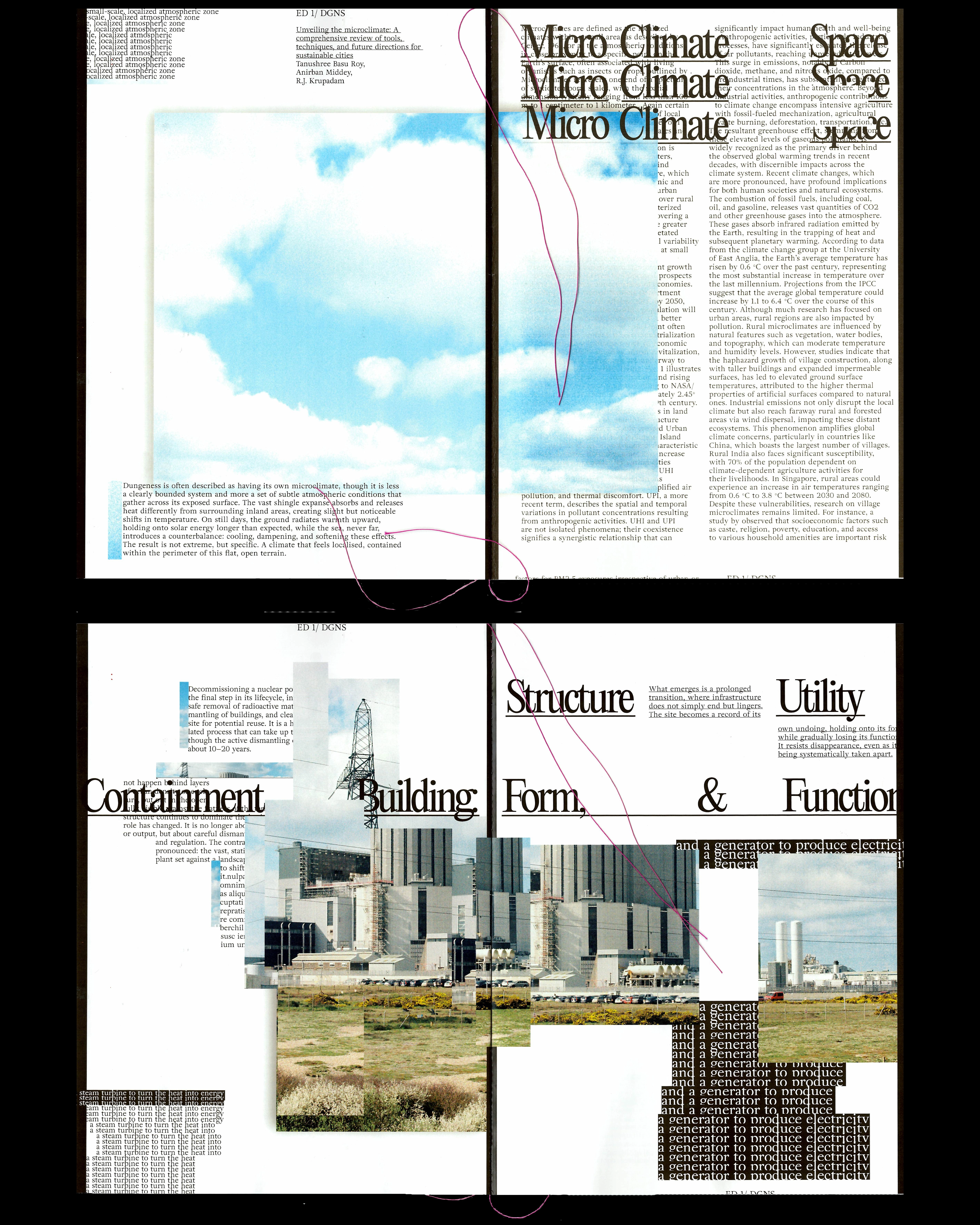
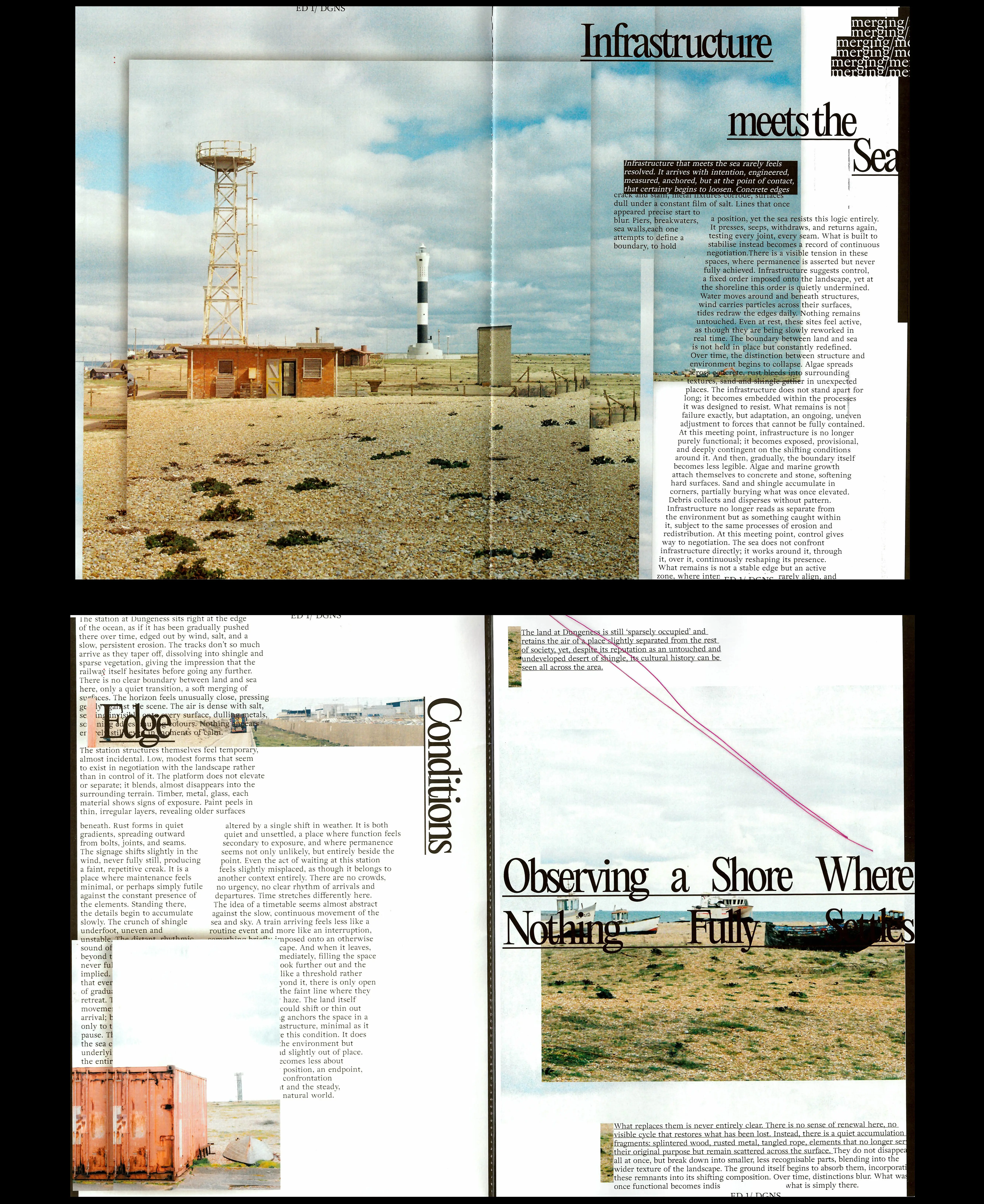
Depleated — 04.26

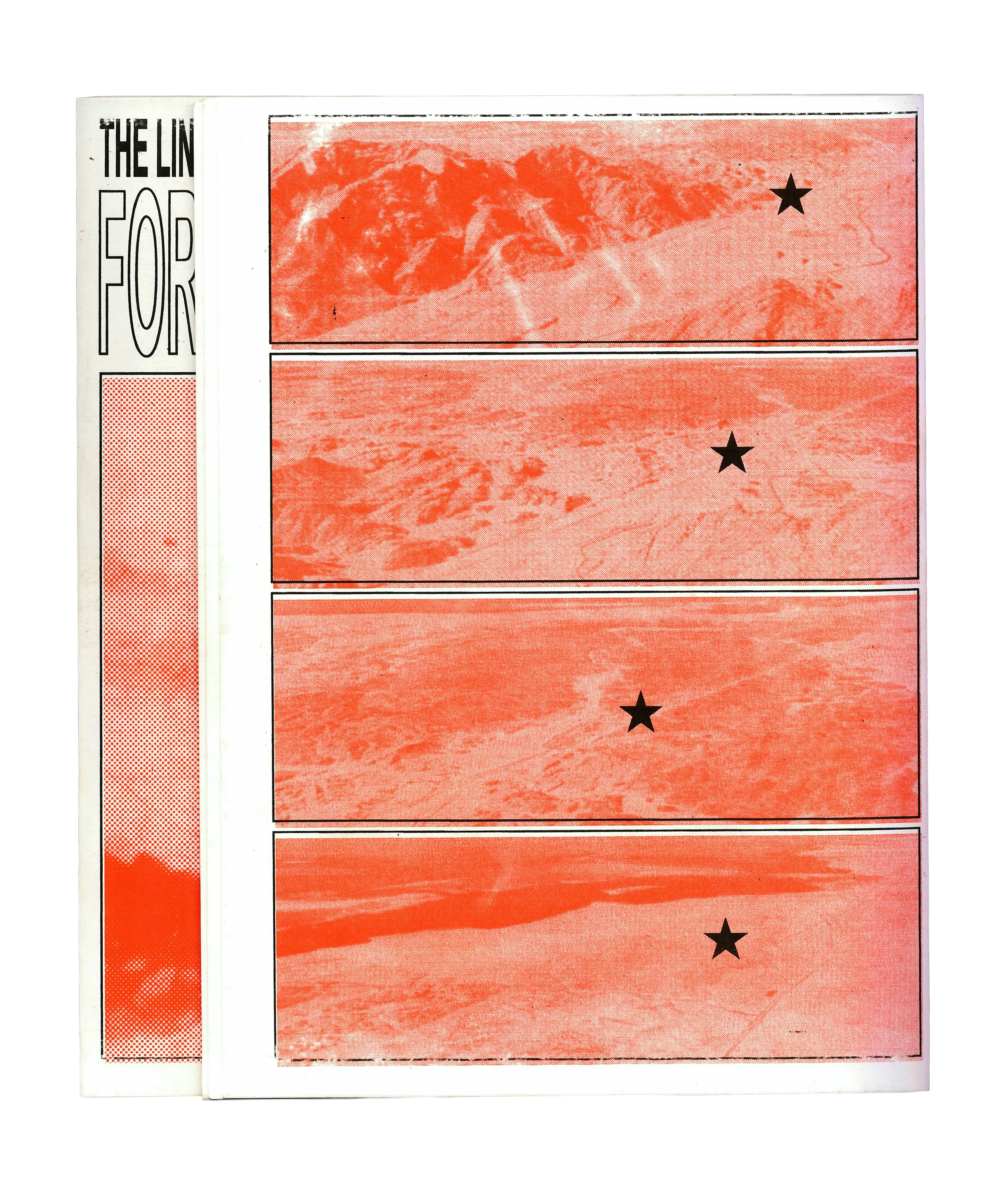
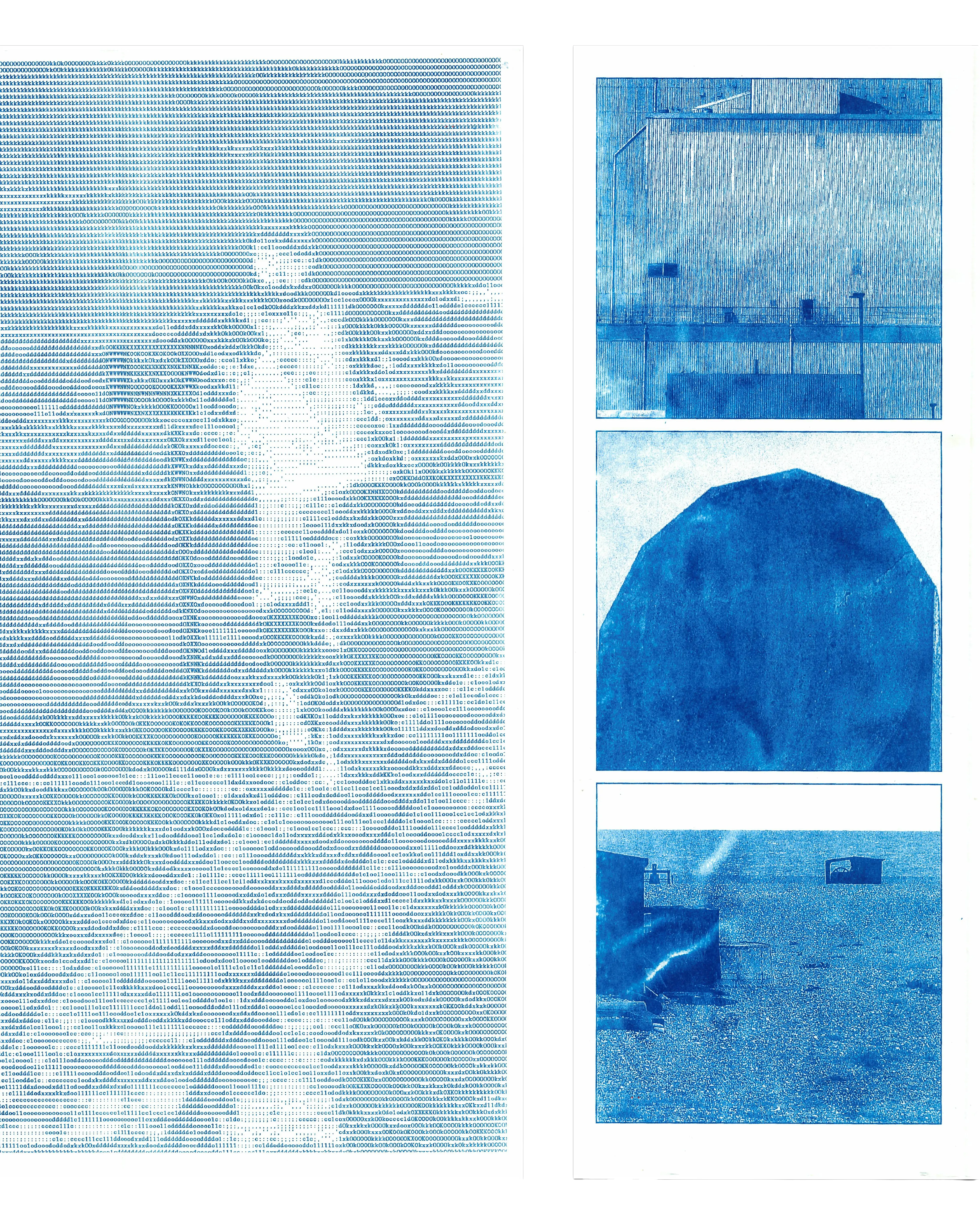
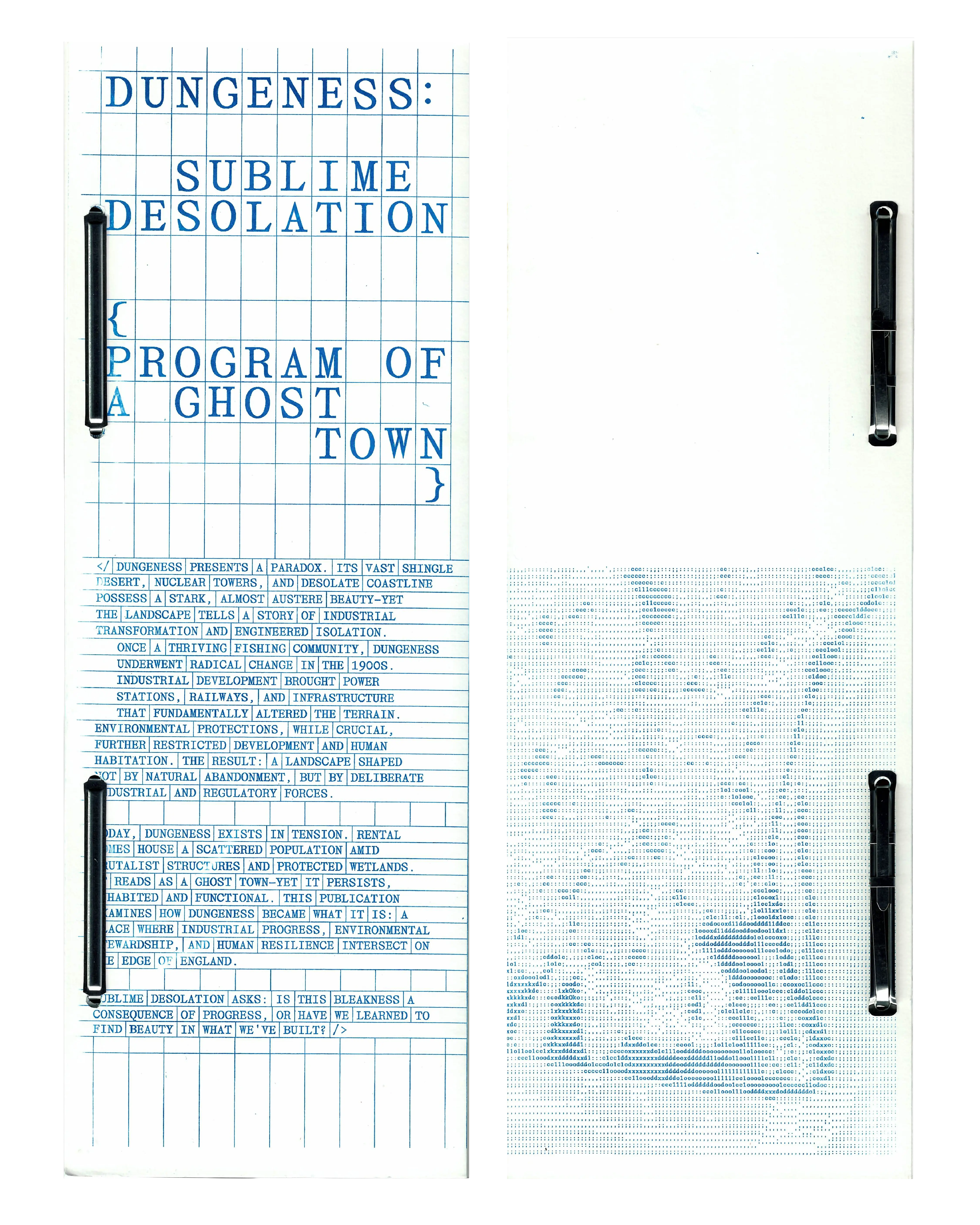
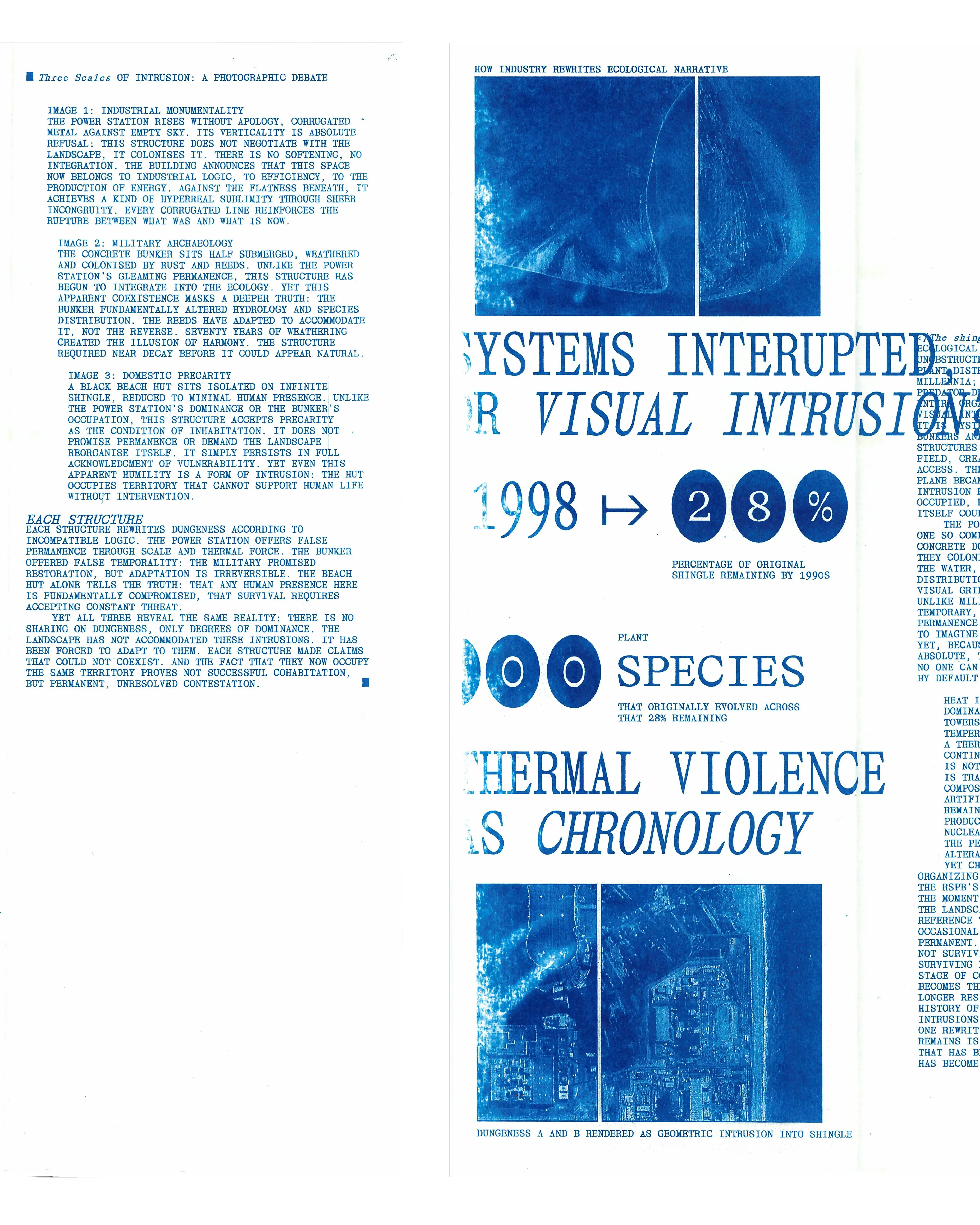
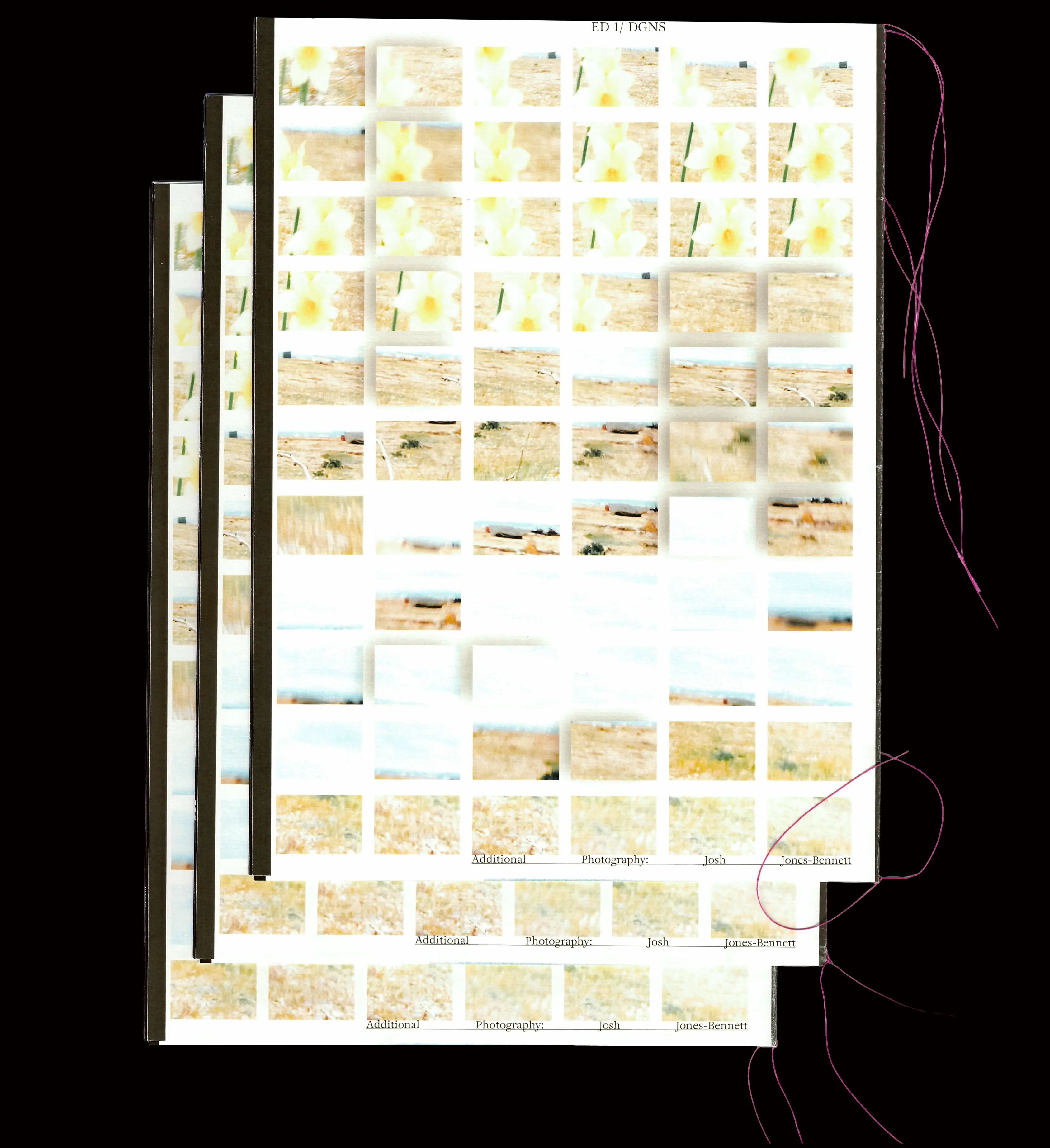
A collaborative publication with Will Vaughan on Dungeness, its nuclear power station, built environment and microclimate. Film photography, experimental type and running bars of cropped image “colour stamps”, with a matte cartridge cover and glossy interior, machine-sewn in pink thread. Designed in 48 hours.
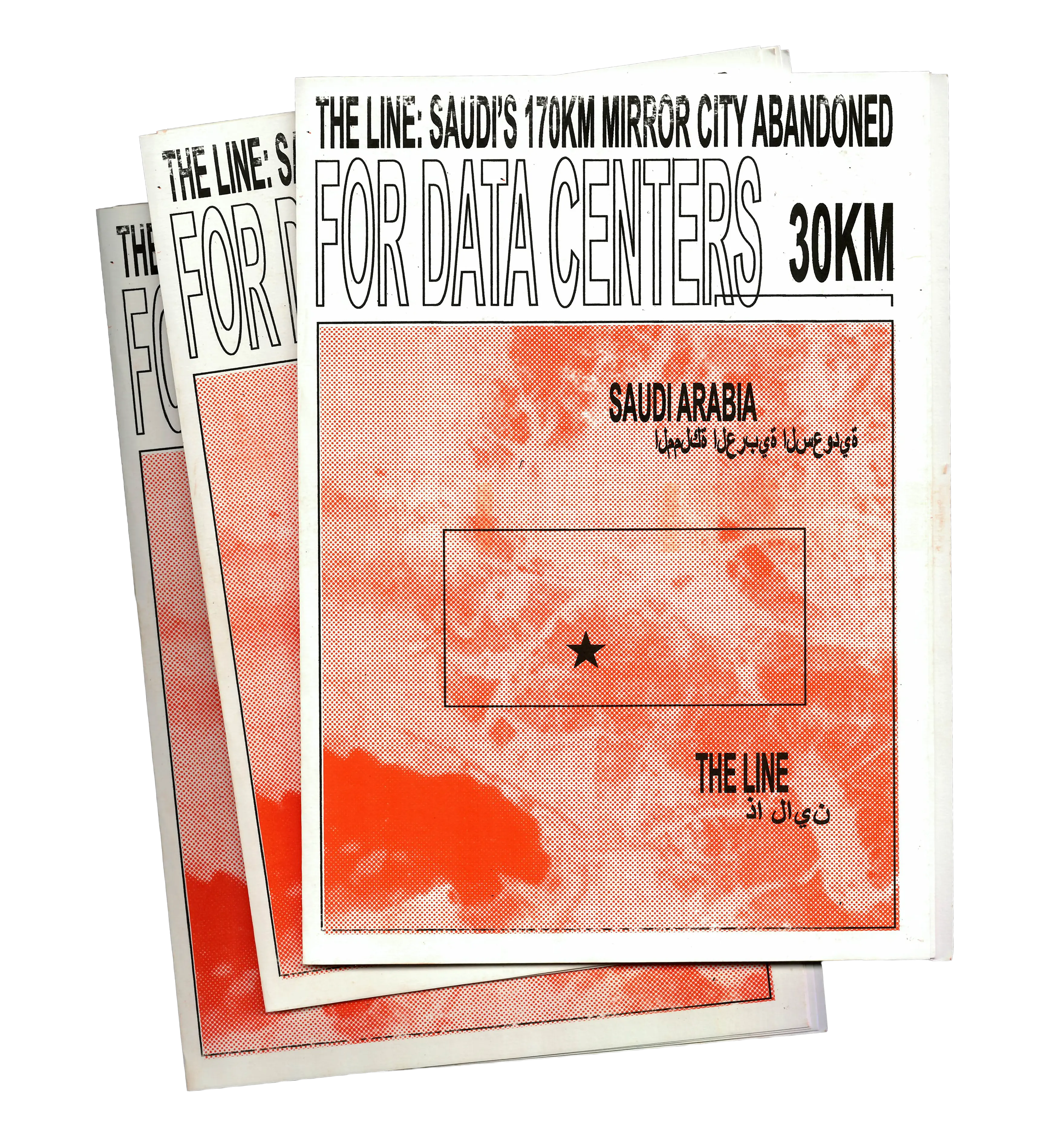
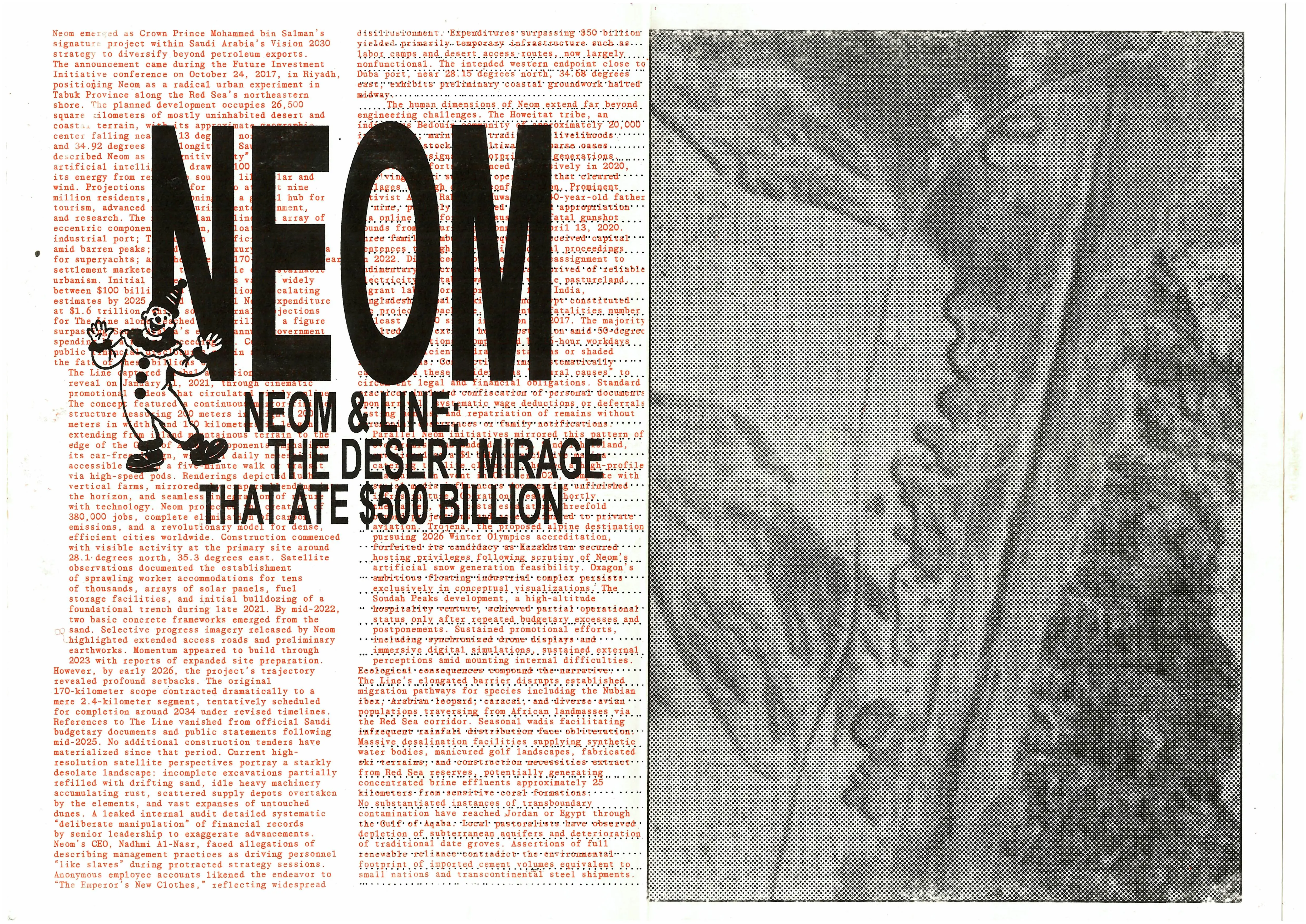
The Line: Render to Reality Editorial Study 03.26

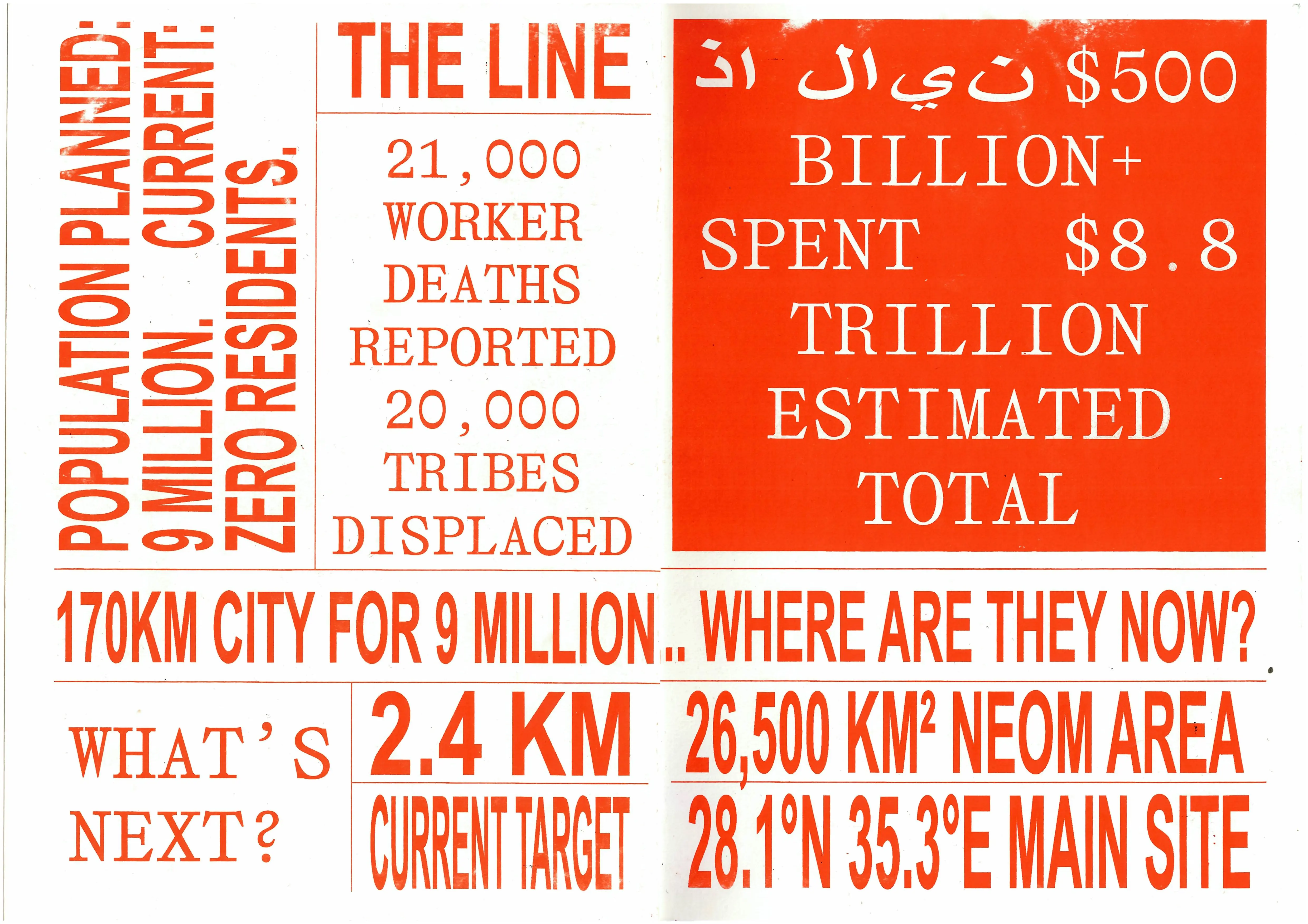
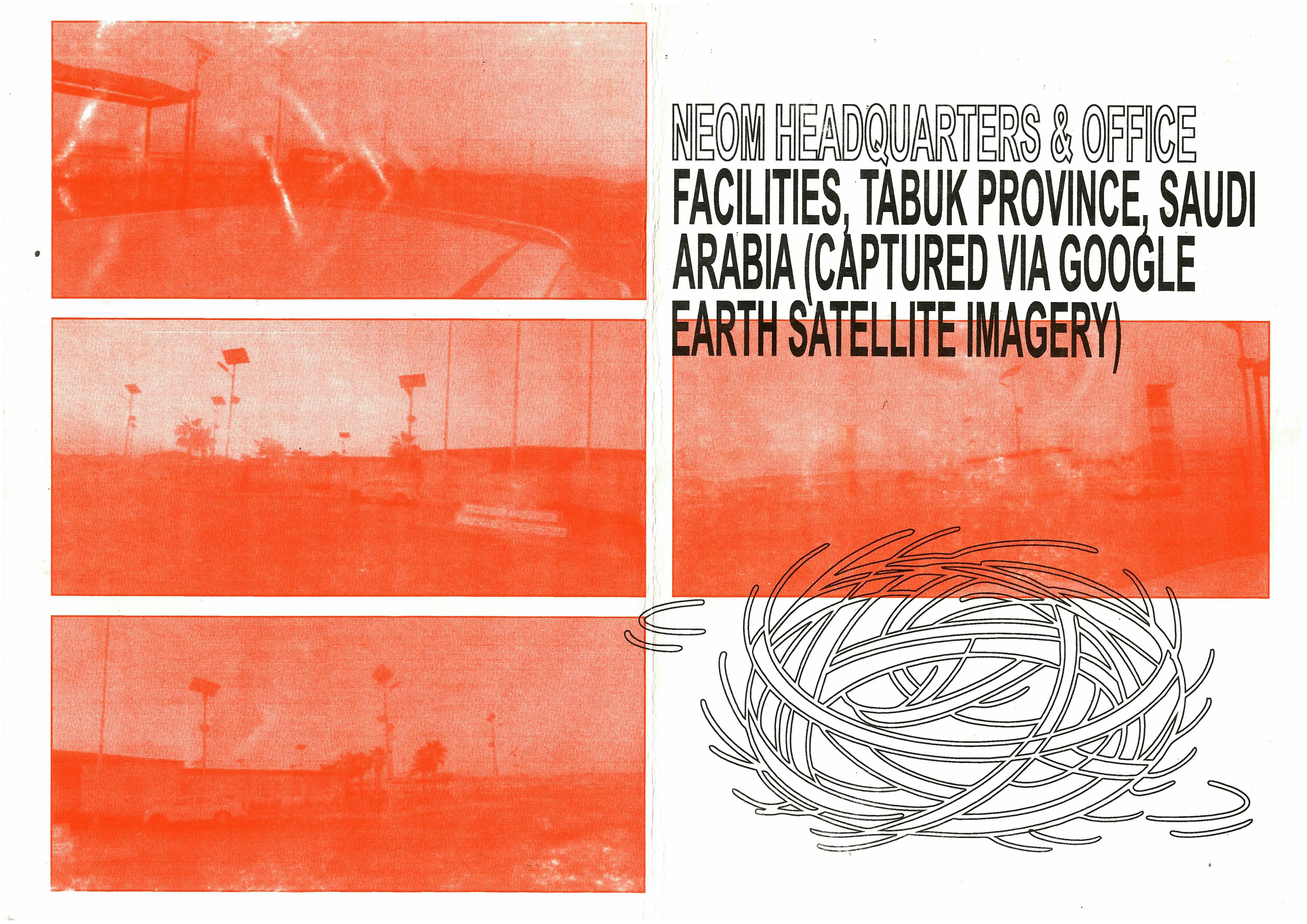
A 12-page zine on the gap between the utopian imagery of NEOM's The Line and its scaled-back reality: a planned 170 km city now reduced to roughly 2.4 km. Punk flyer graphics, halftone satellite strips and deadpan statistics collide across A3 recycled stock, folded, machine-sewn and packaged in a plastic sleeve. Made in 24 hours.
Sublime Desolation Experimental 04.26

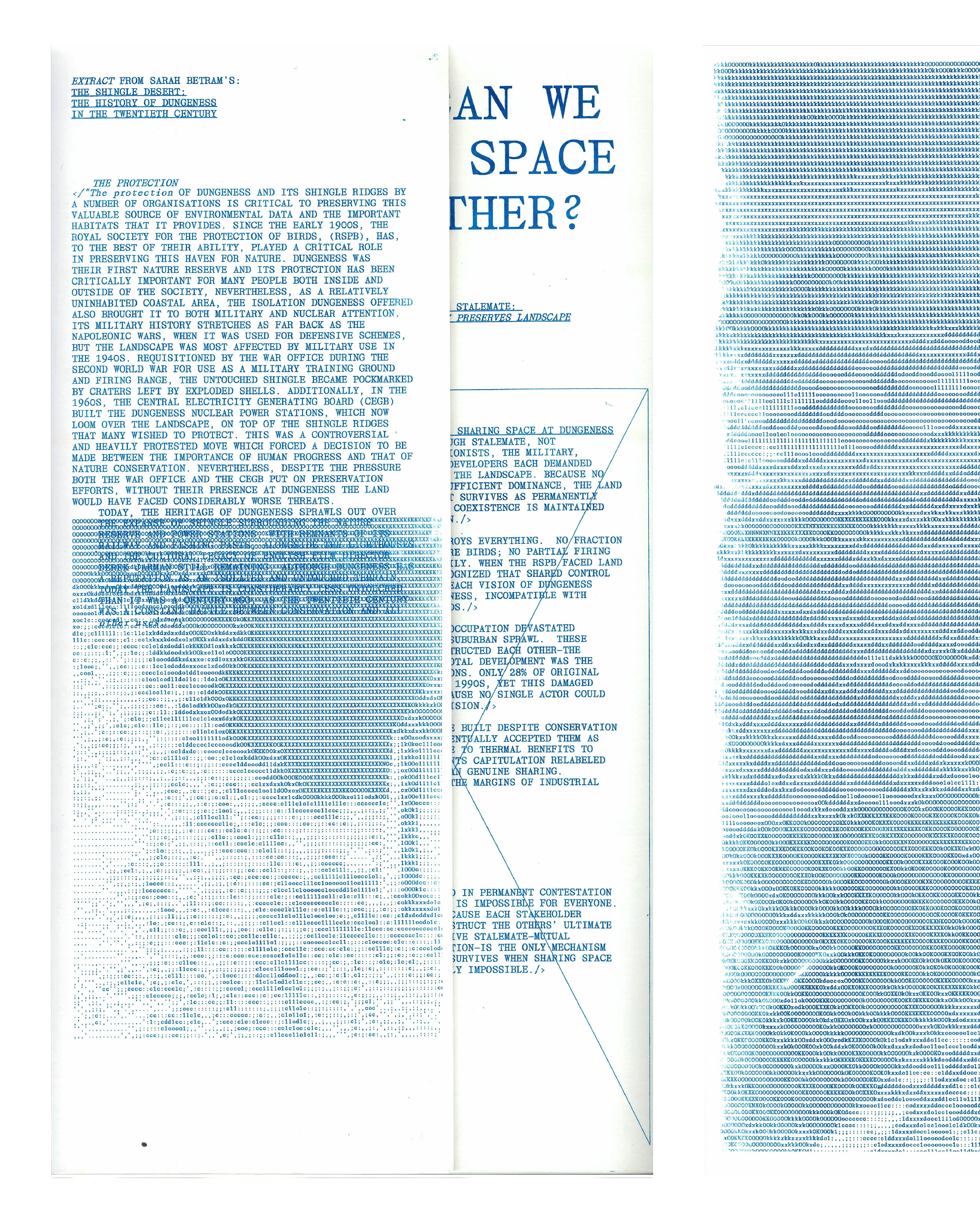
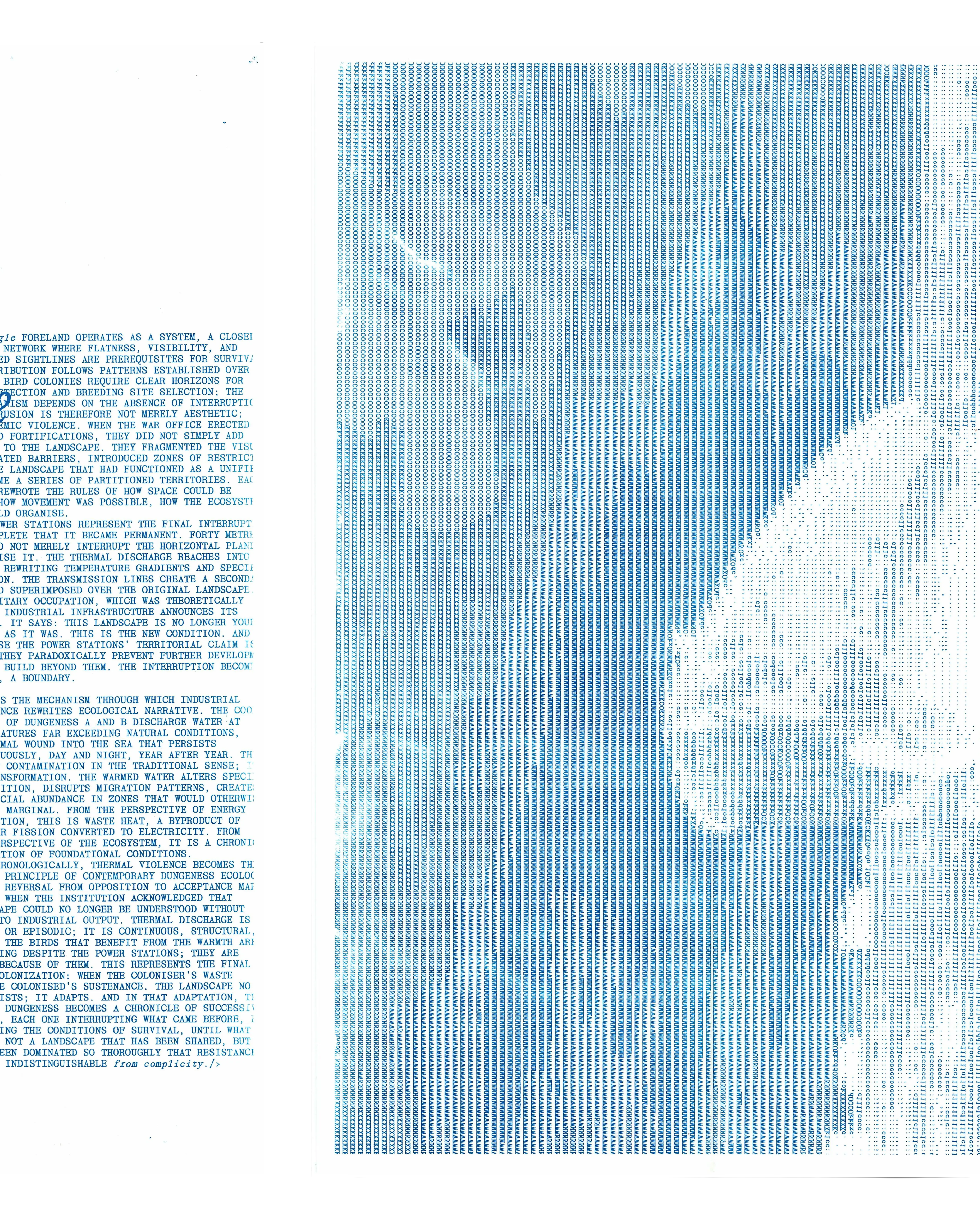
An observational publication on Dungeness as a landscape claimed by conservation, military use, nuclear power, tourism and ecology. Tall A3-folded format printed in blue risograph, with ASCII images hidden inside Japanese-bound pages and the whole held together with filing clips. Set in Affairs Mono.

Land as Power Print 11.25

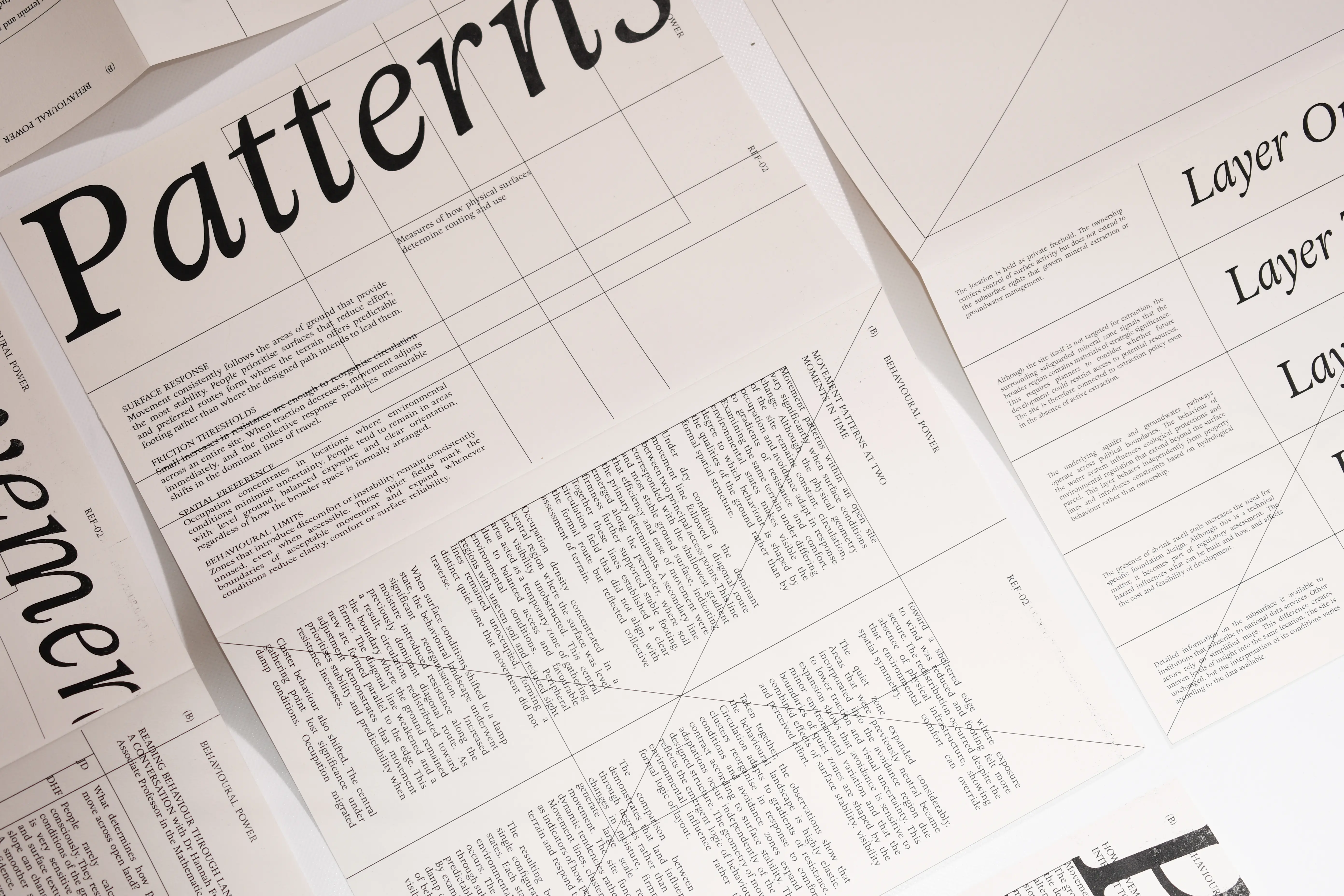
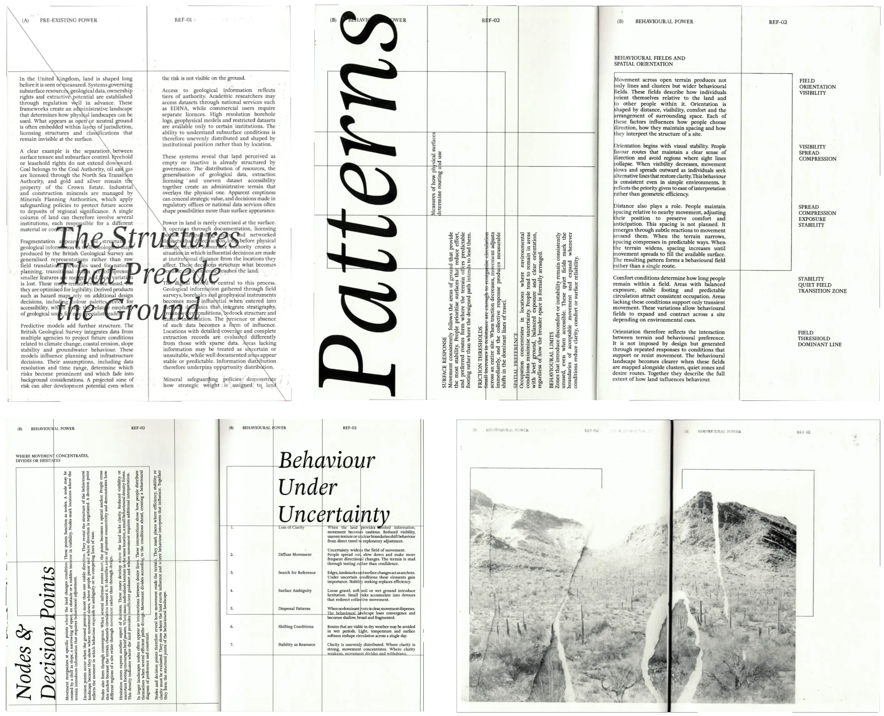
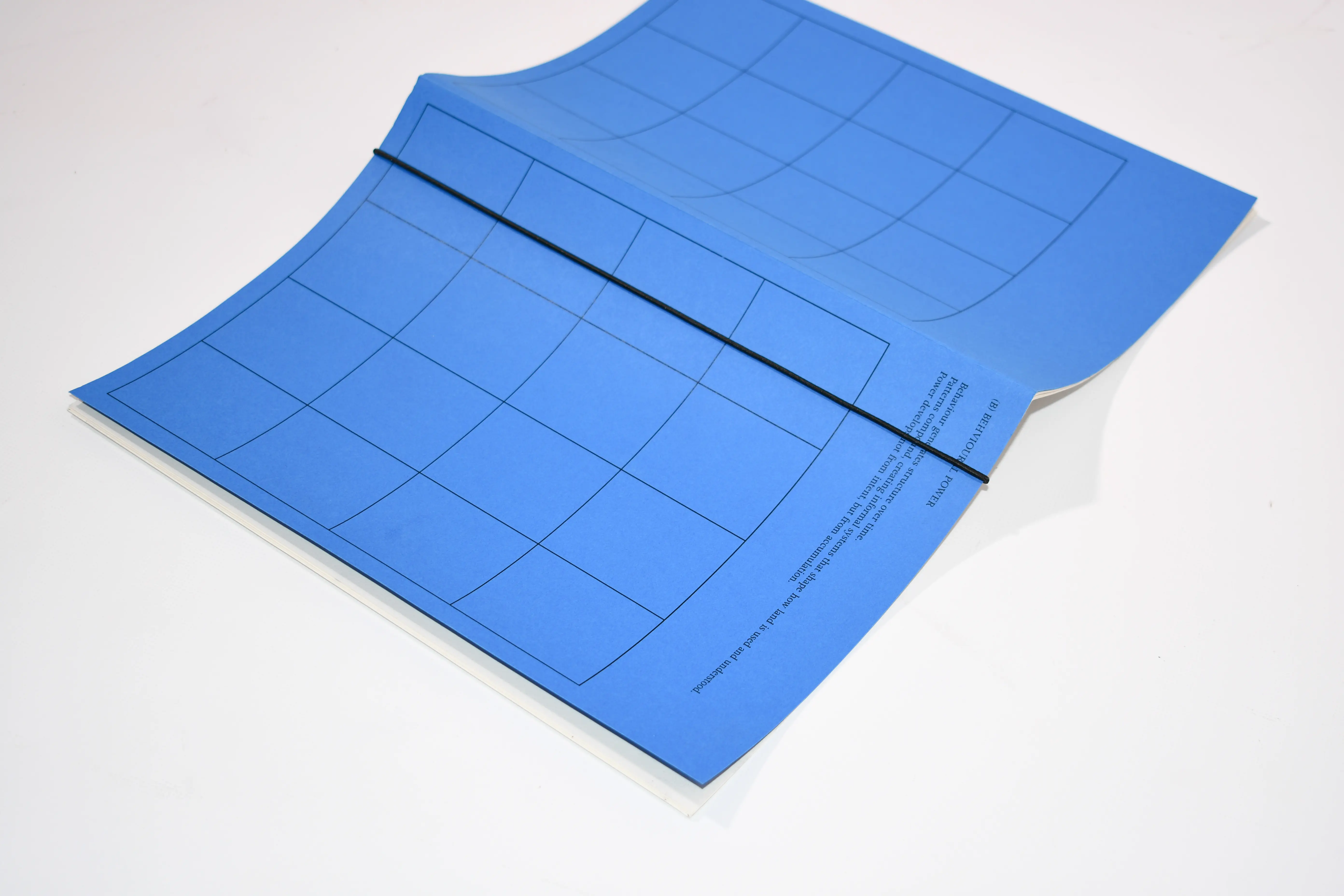
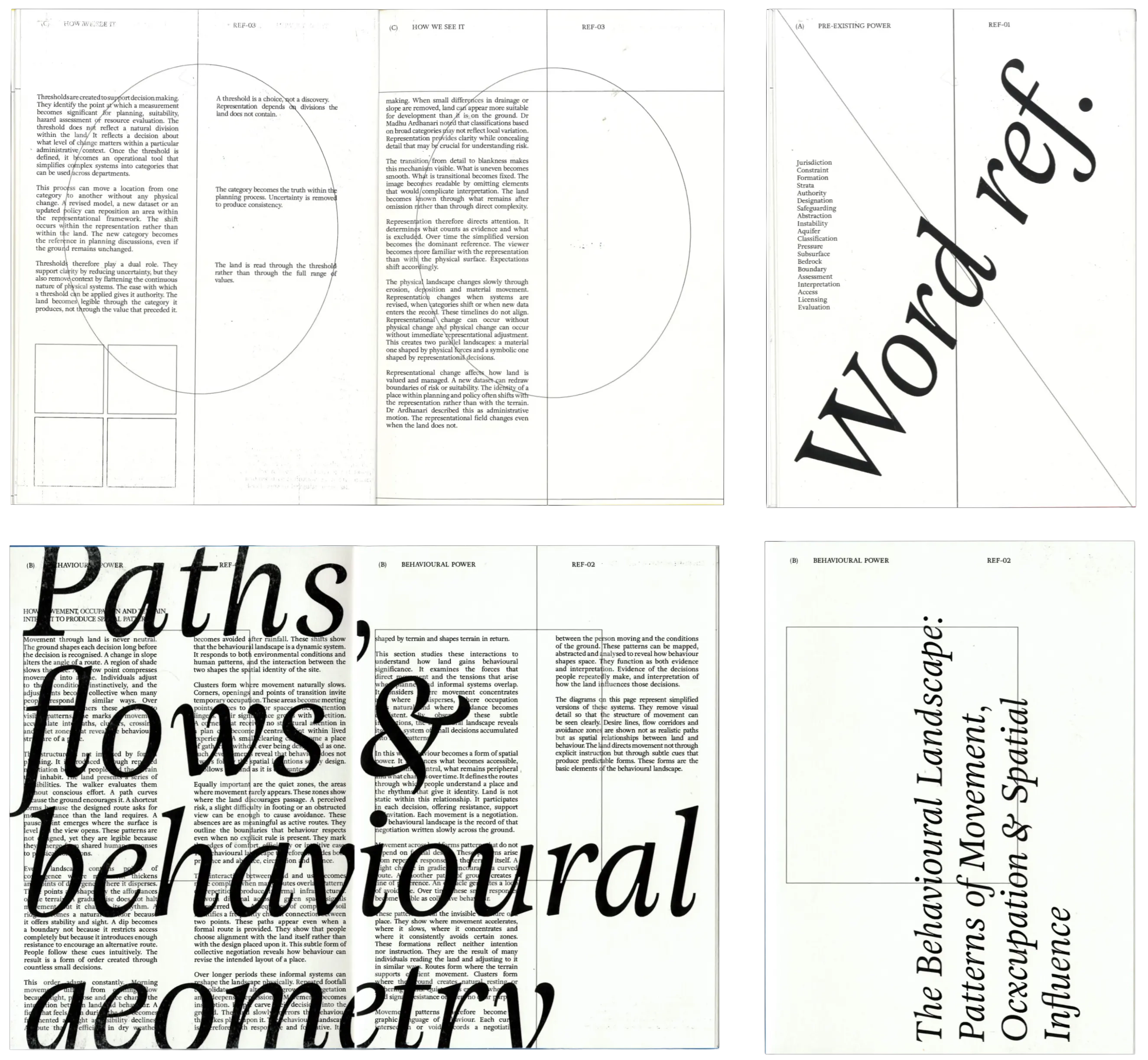
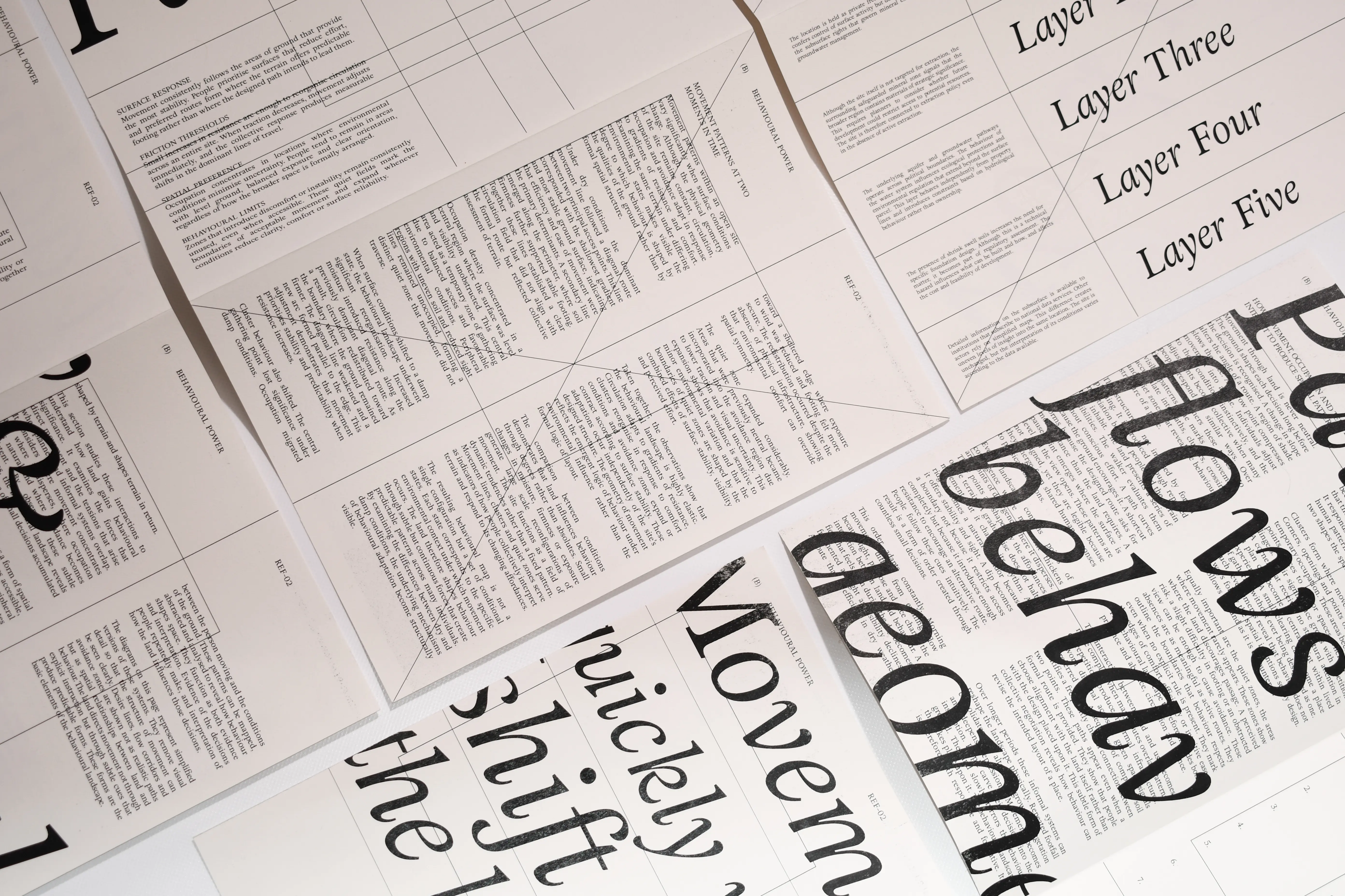
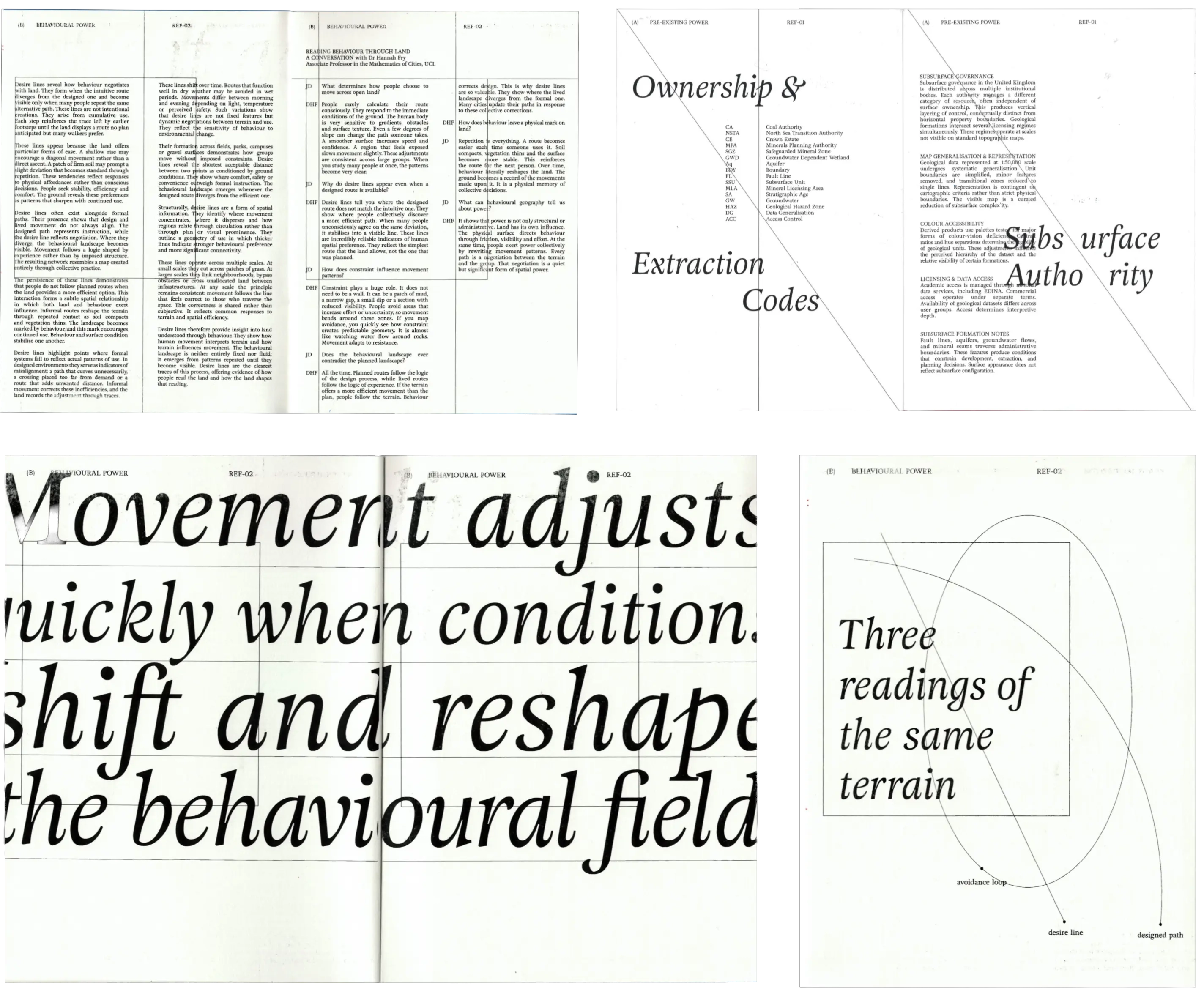
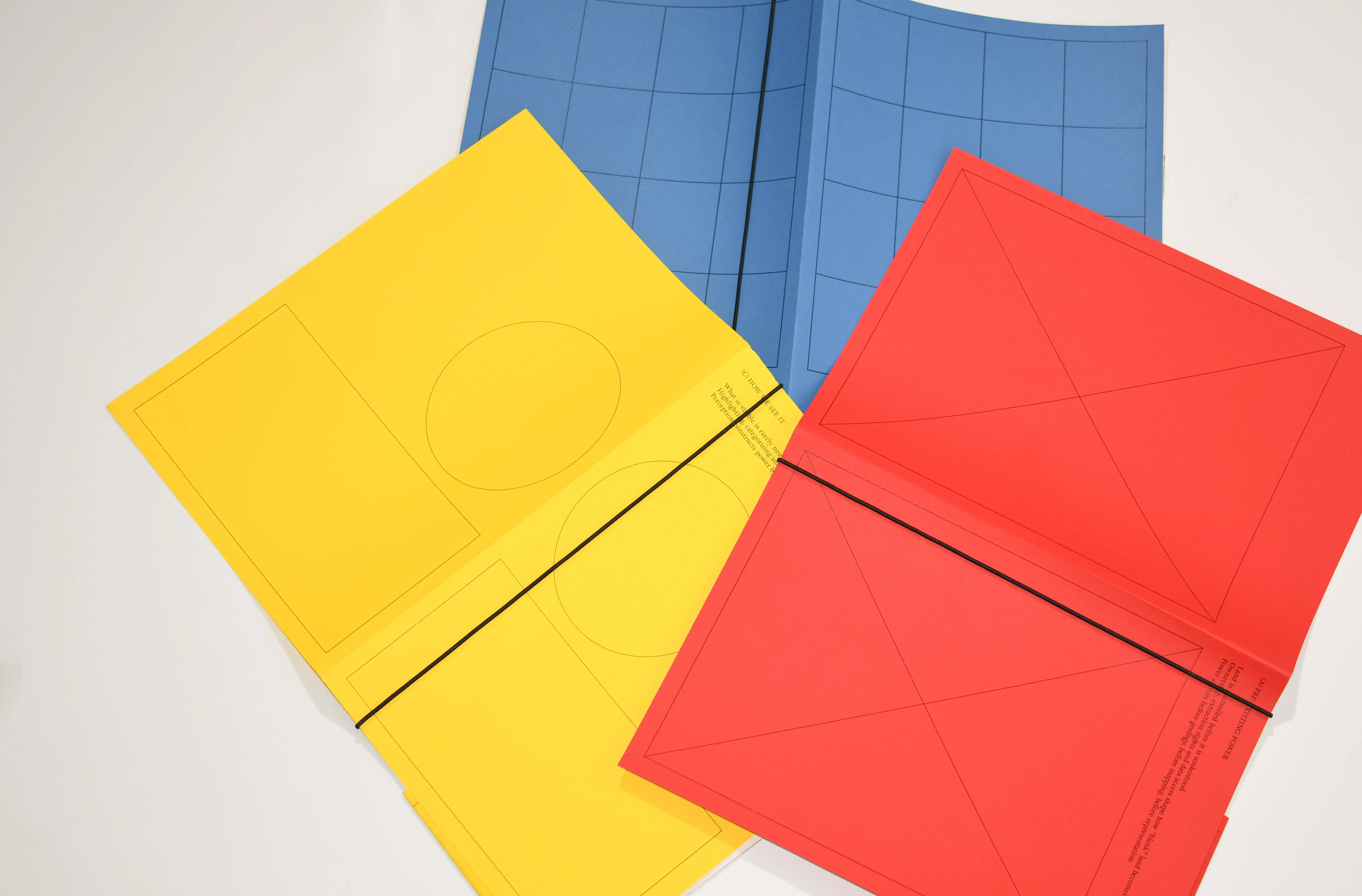
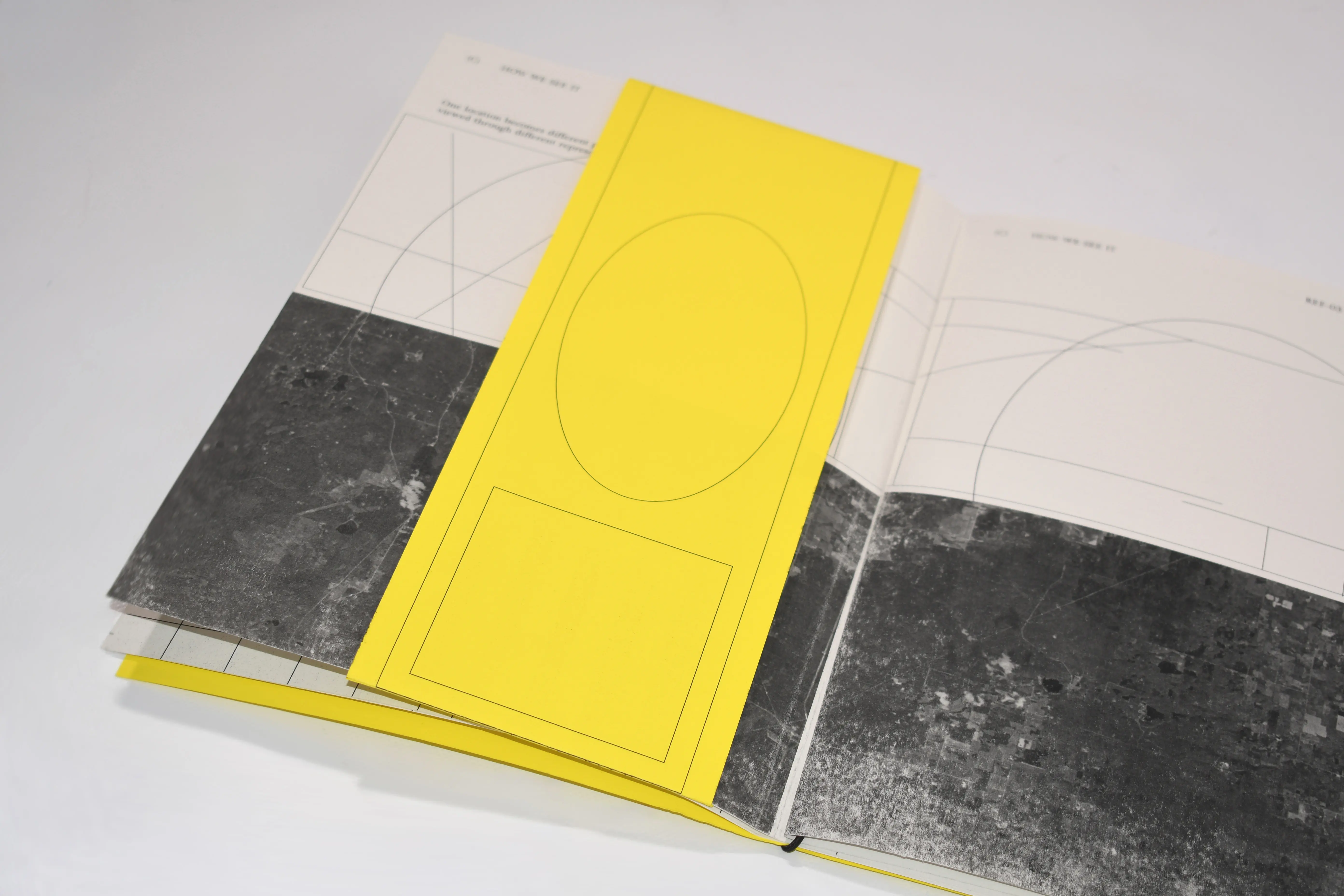
A response to the ISTD brief on Power, treating land not as landscape but as force, surface and structure. Three loose booklets, each tied to a primary colour and a mode of power: pre-existing (red), behavioural (blue) and perceived (yellow). 200 × 280 mm, GF Smith Colorplan covers and 160gsm interiors, set entirely in Adriane Text and held together by an elastic band.

Jargon Interactive Archive 05.26

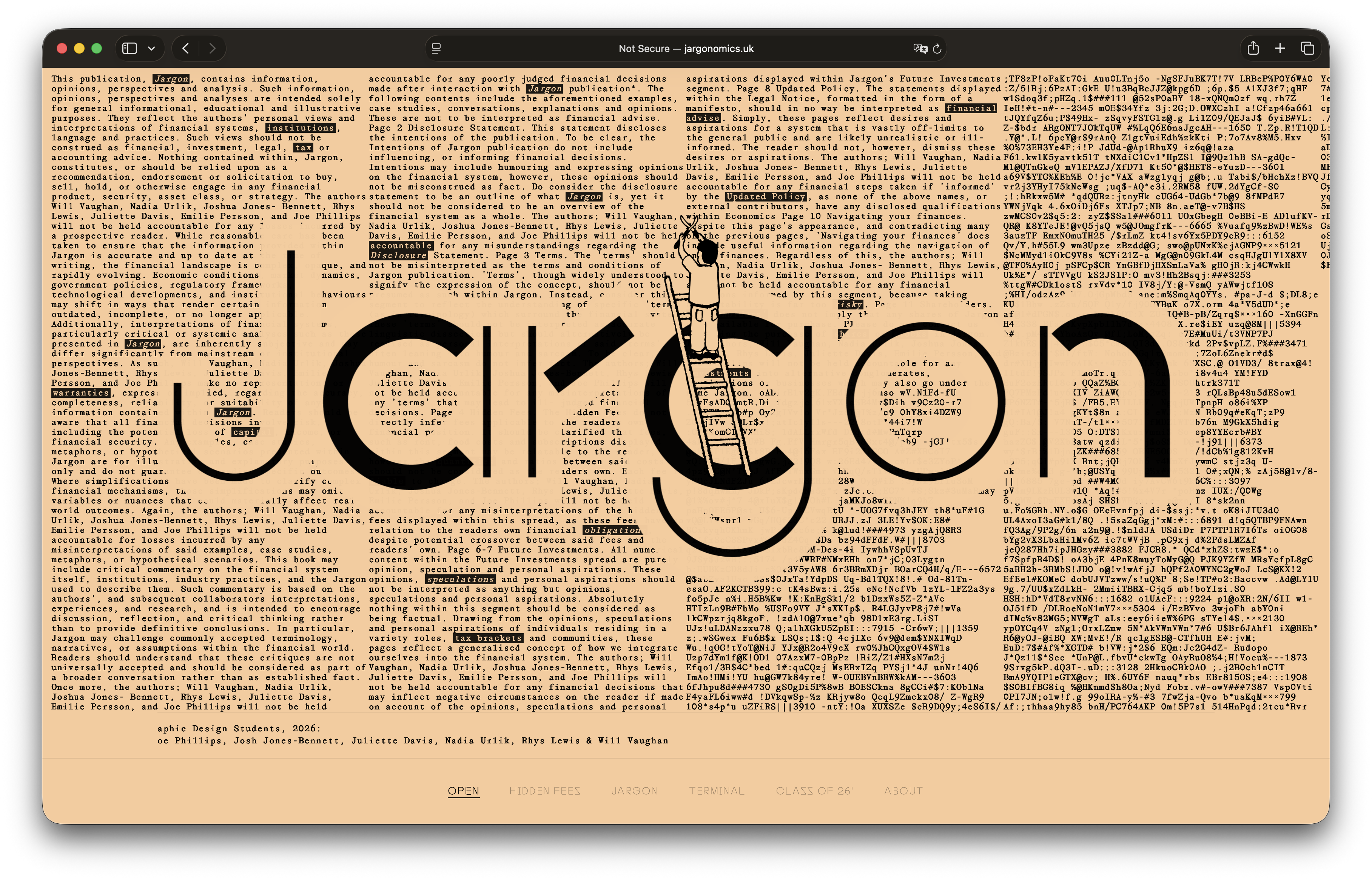
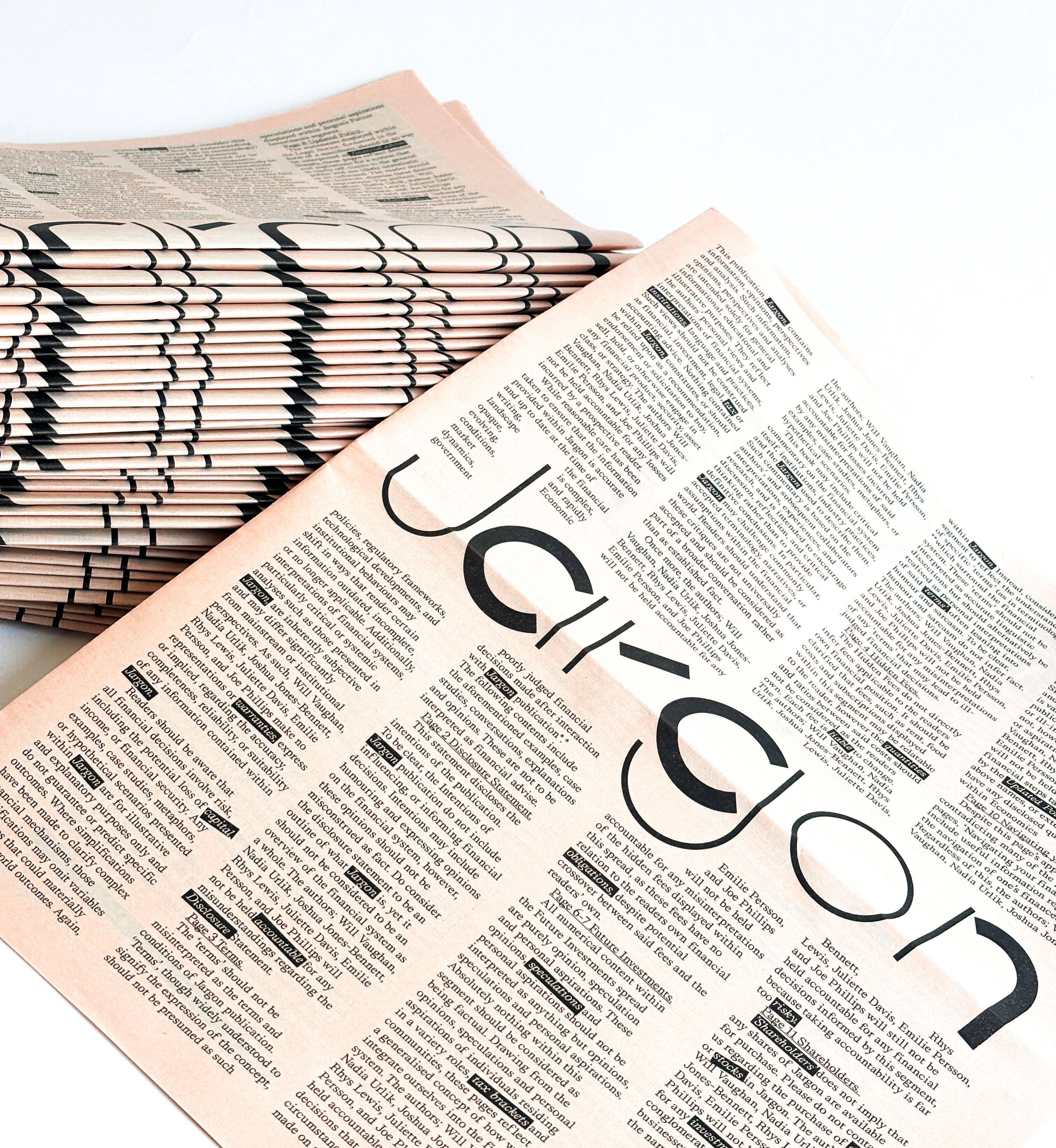
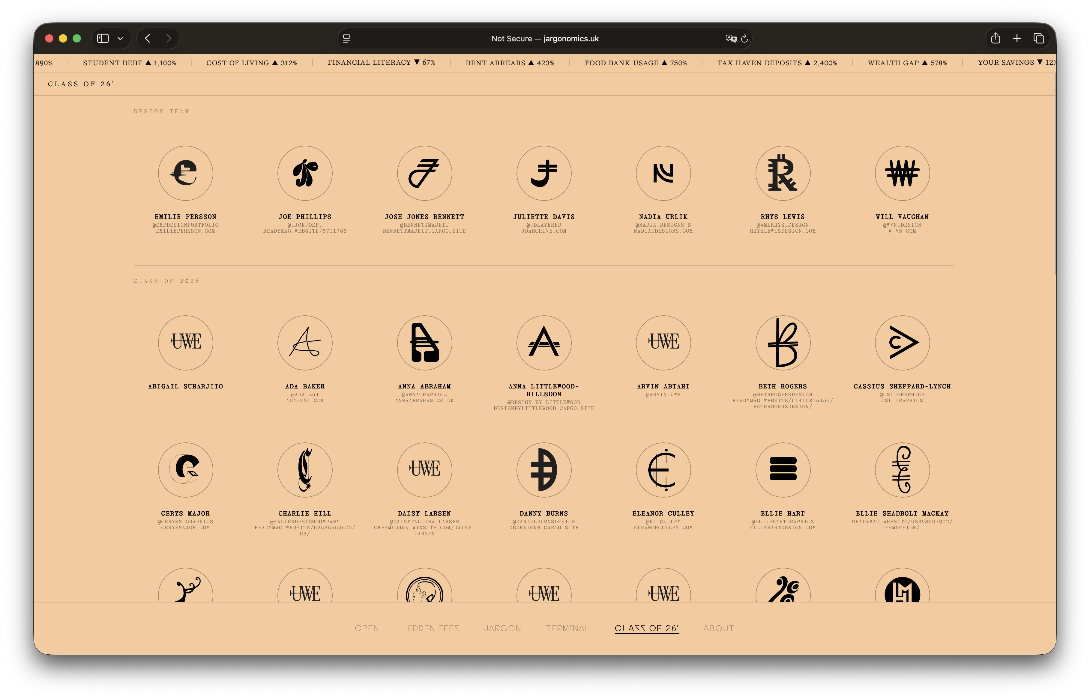
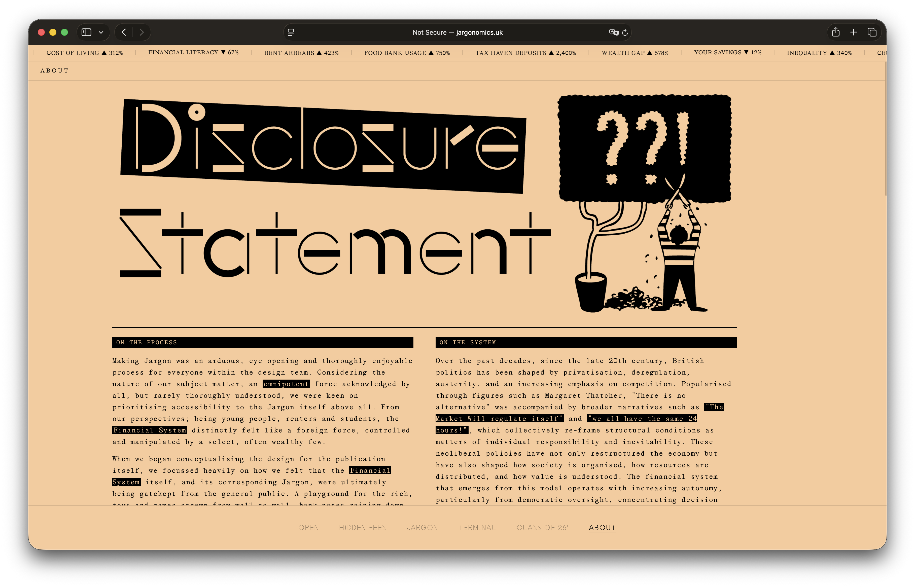
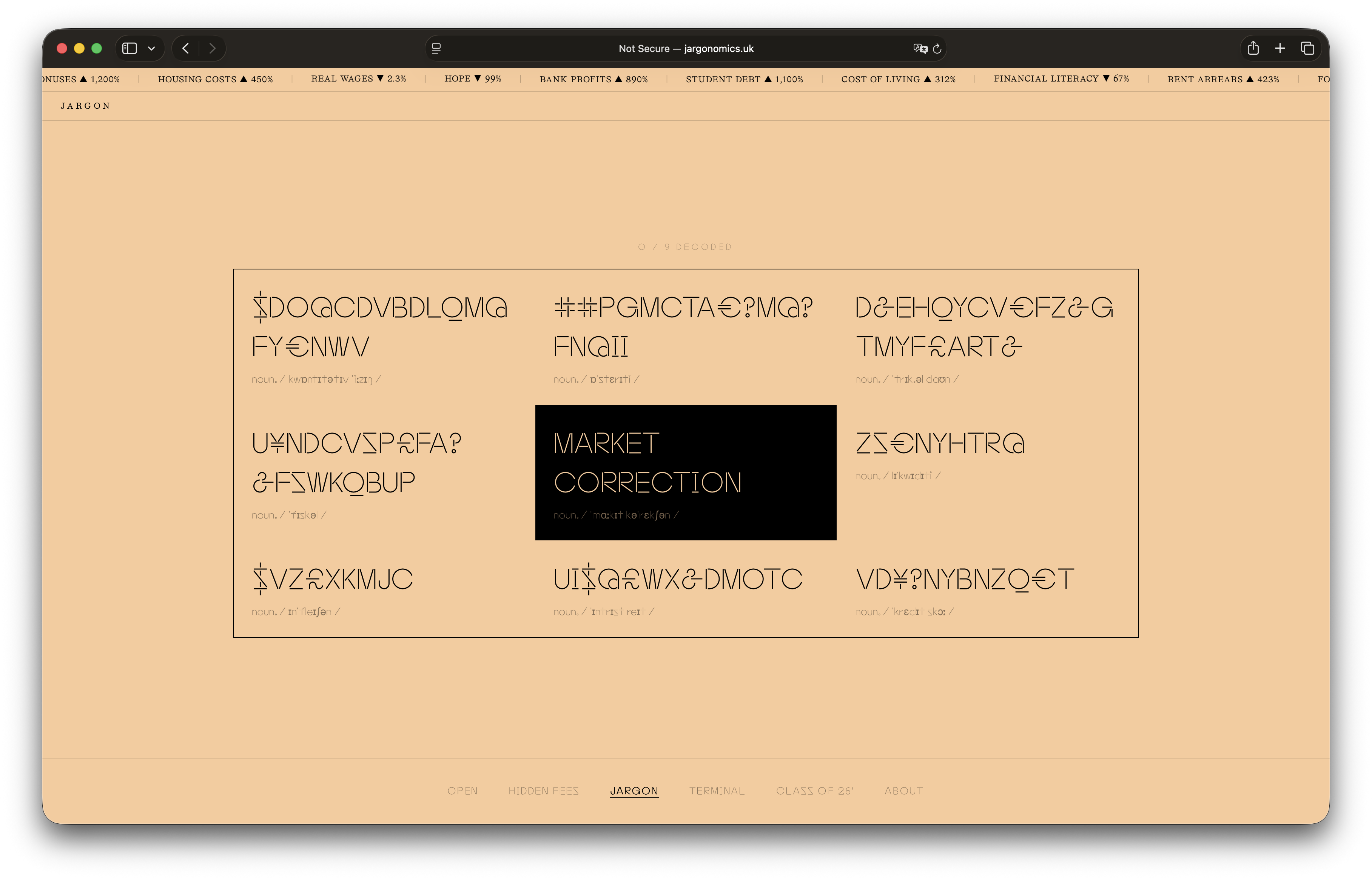
Online archive for Jargon, a 2000-copy end-of-year publication from UWE Bristol's 2026 graduating class. Presents the publication and its contents alongside the students' own websites through interactive features. Built independently, alongside six design students working in print. jargonomics.uk

Repères Estivaux Typography 06.25

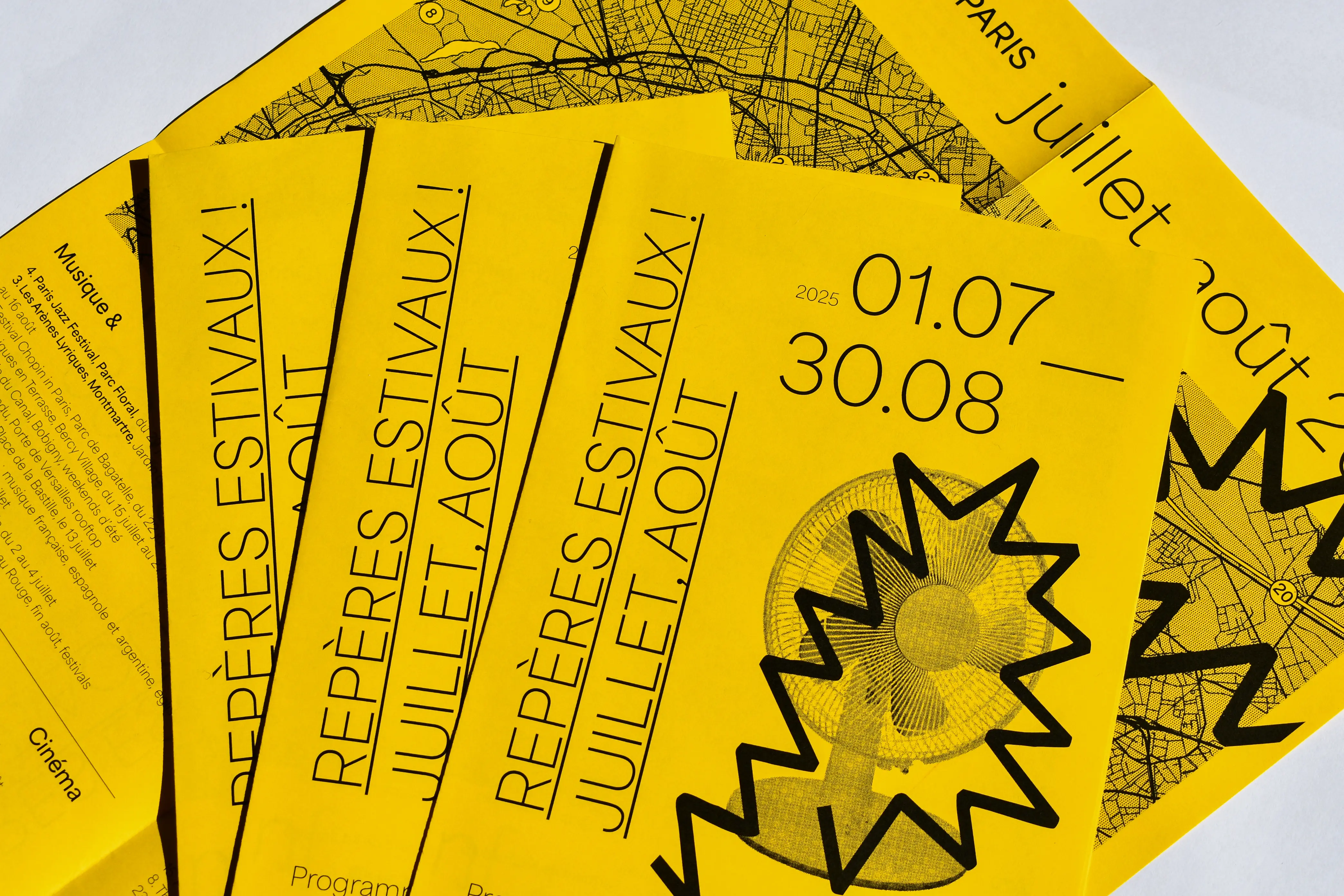
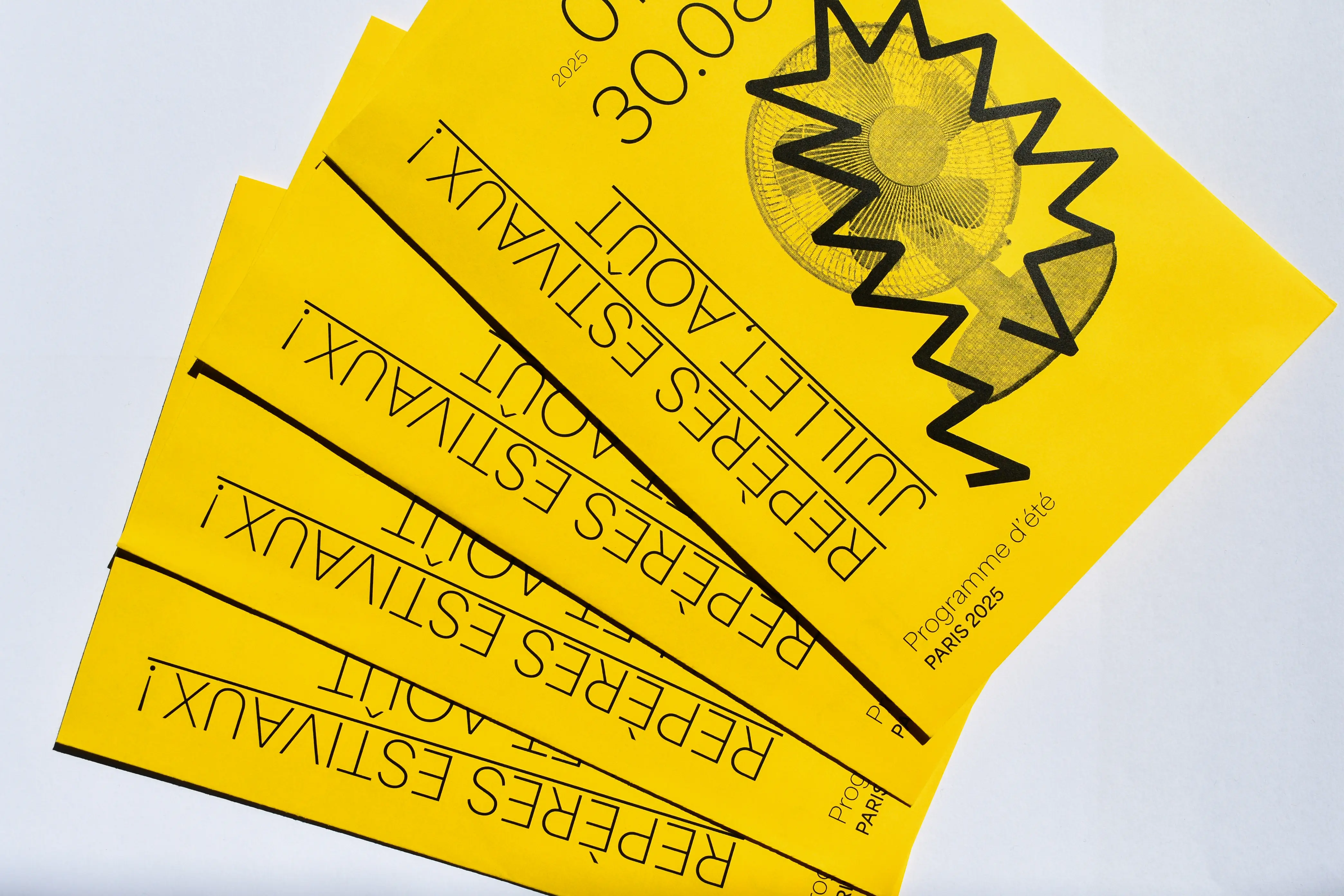
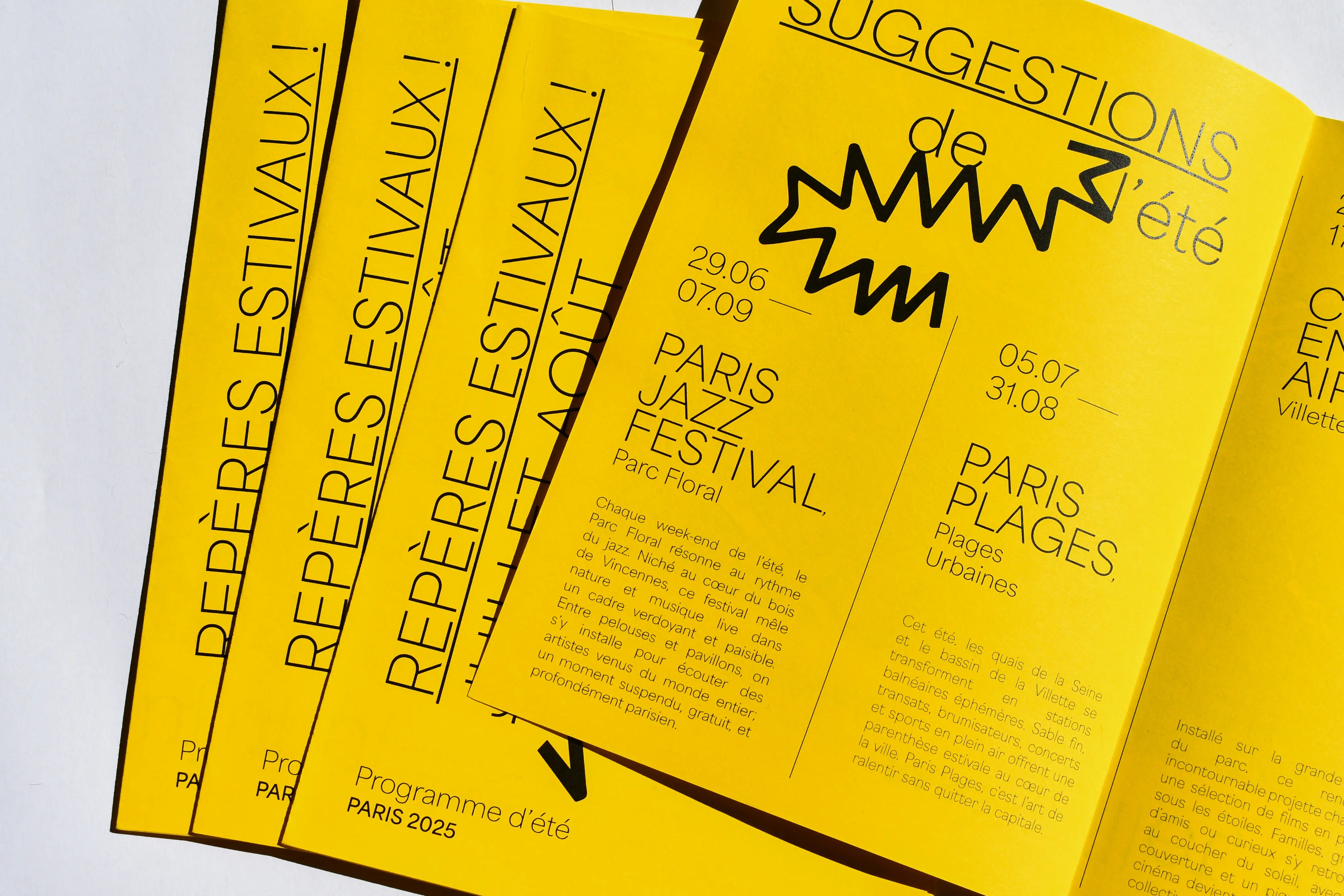
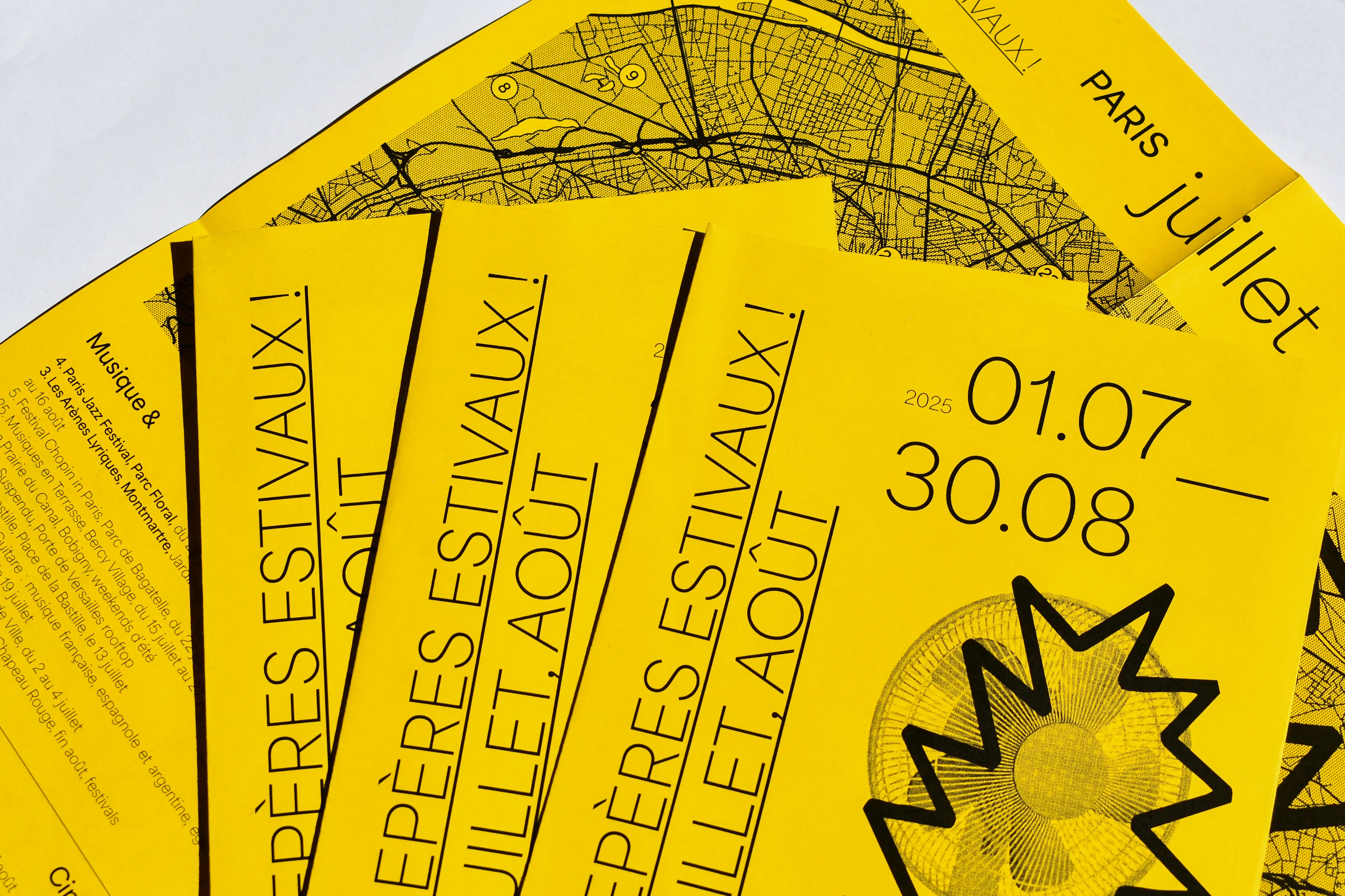
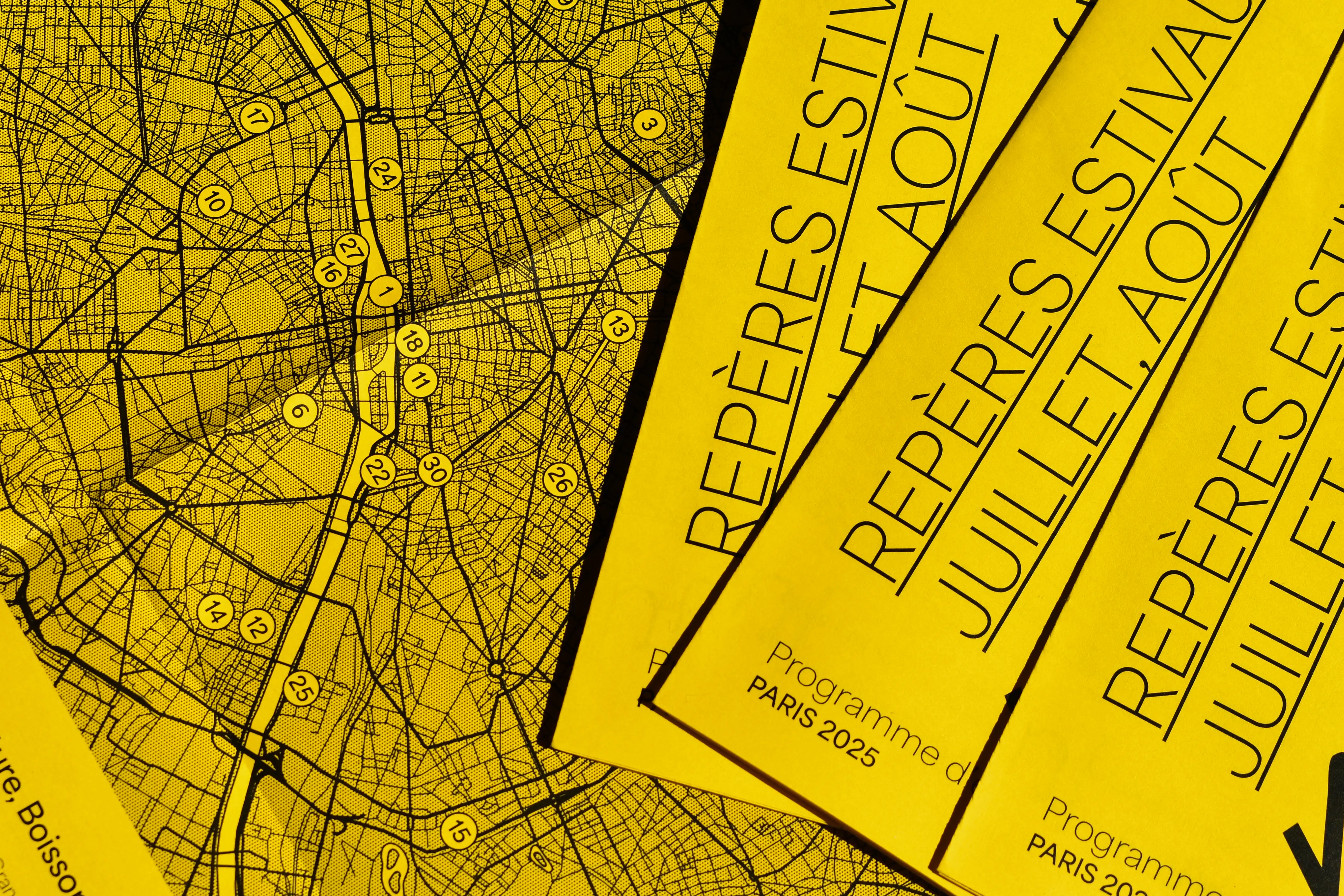
A love letter to Paris in summer: 31 activities for 31 days, spread across July and August. Each one is numbered and pinned on a pared-back map of the city, from open-air cinema to evenings on the quais. Black ink on bright yellow stock, A3 folded, with a halftone fan on the cover. Written in French and made for the people who stay when the city empties out.

Gateway Publication 04.25

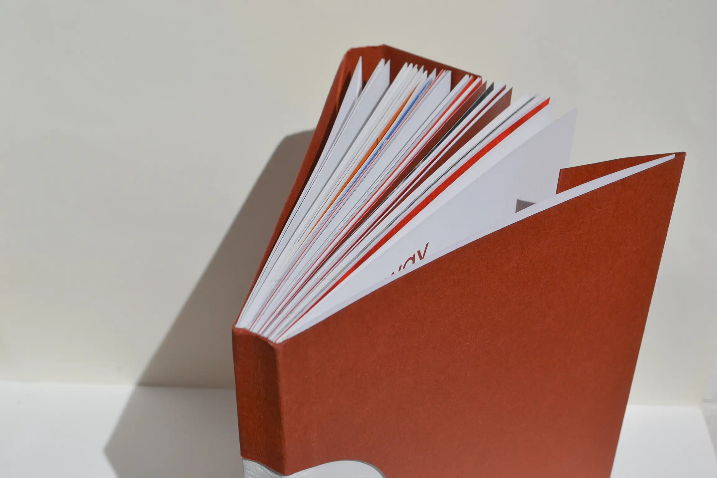
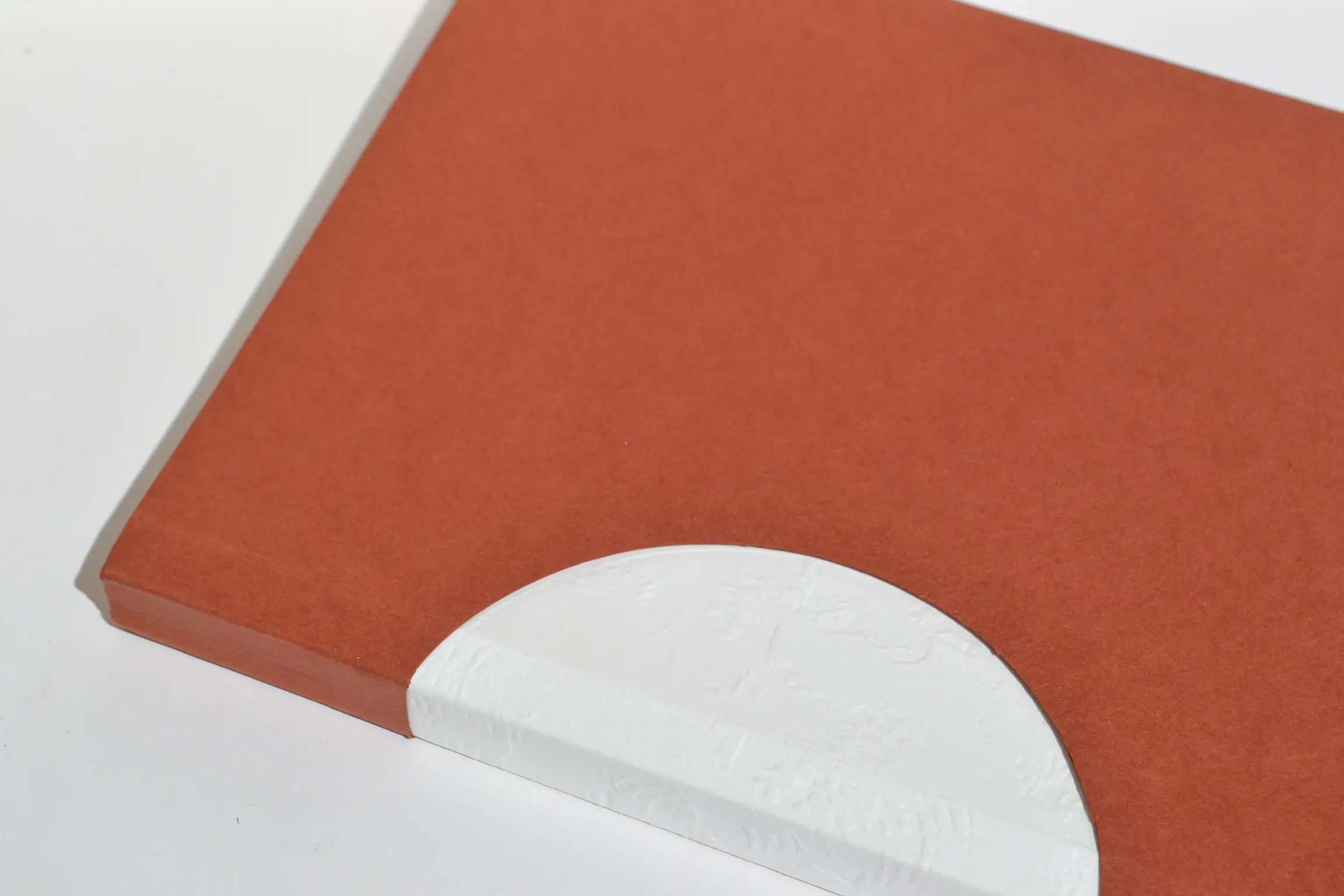
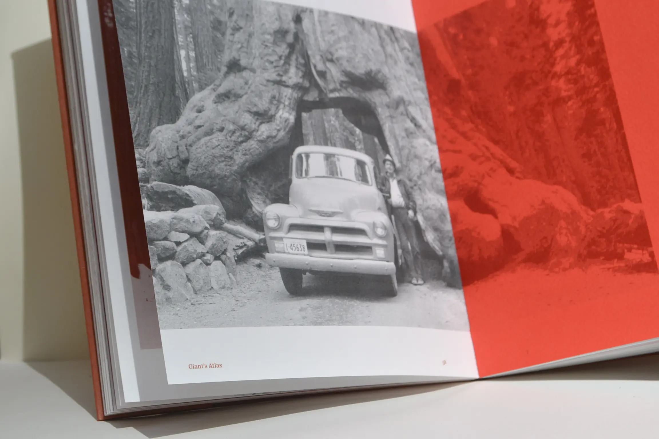
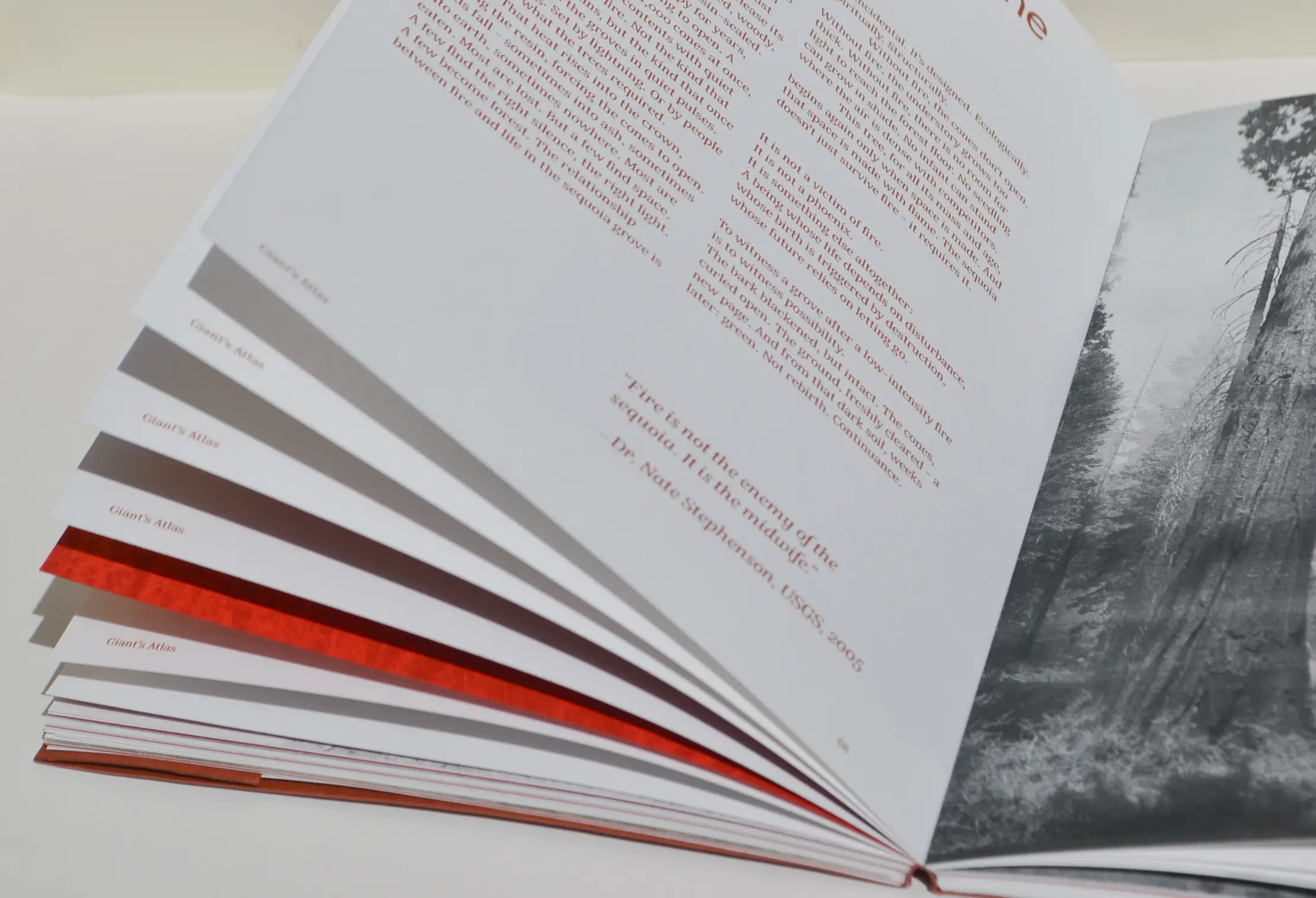
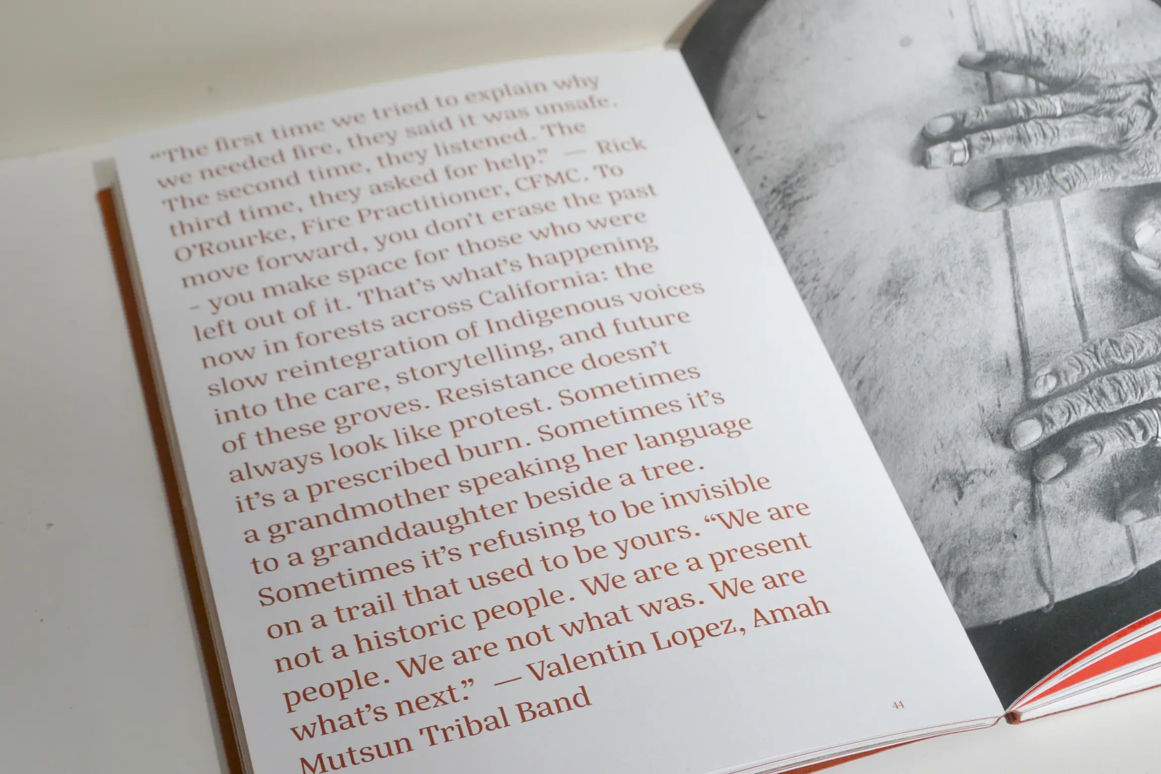
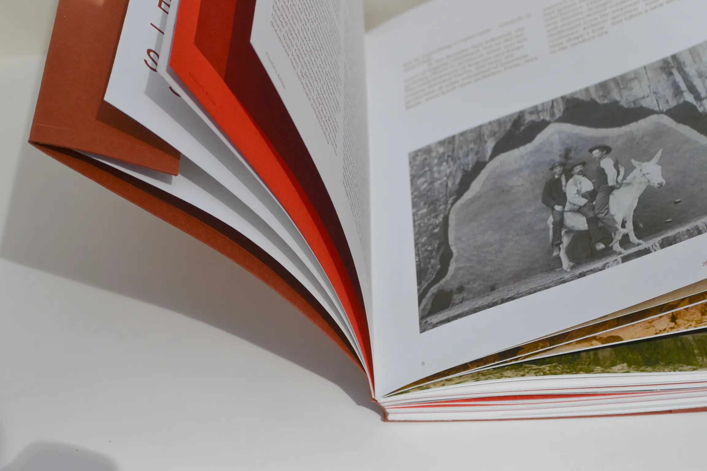
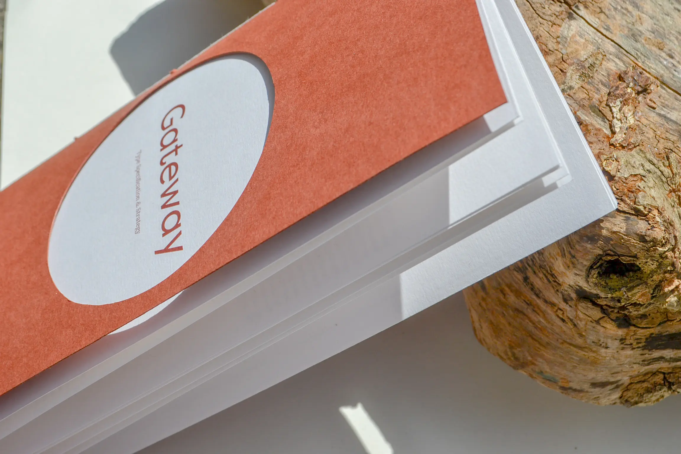
A longform publication on giant sequoias, moving through resilience, memory, mythology, tourism and reverence. Built from National Park Service archive material, scientific writing and Indigenous narratives, with chapter headers made from my own tree-bark rubbings. Embossed trunk cross-section cover, circular cut-outs, tip-ins on off-white 160gsm stock, perfect bound in a bark-like wrap-around cover. Set in Filson Pro and Silva Text.

Echo Print System 10.25

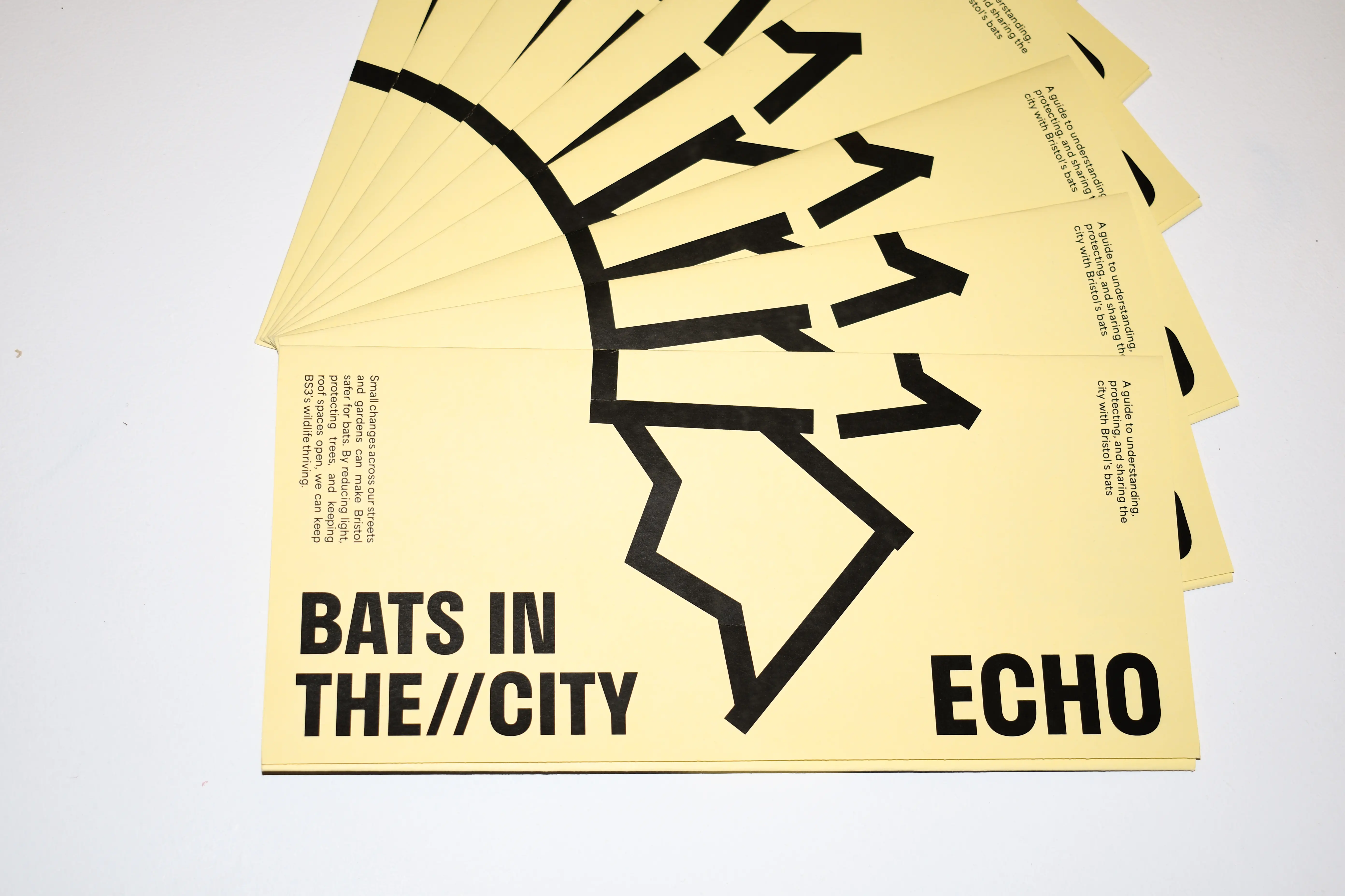
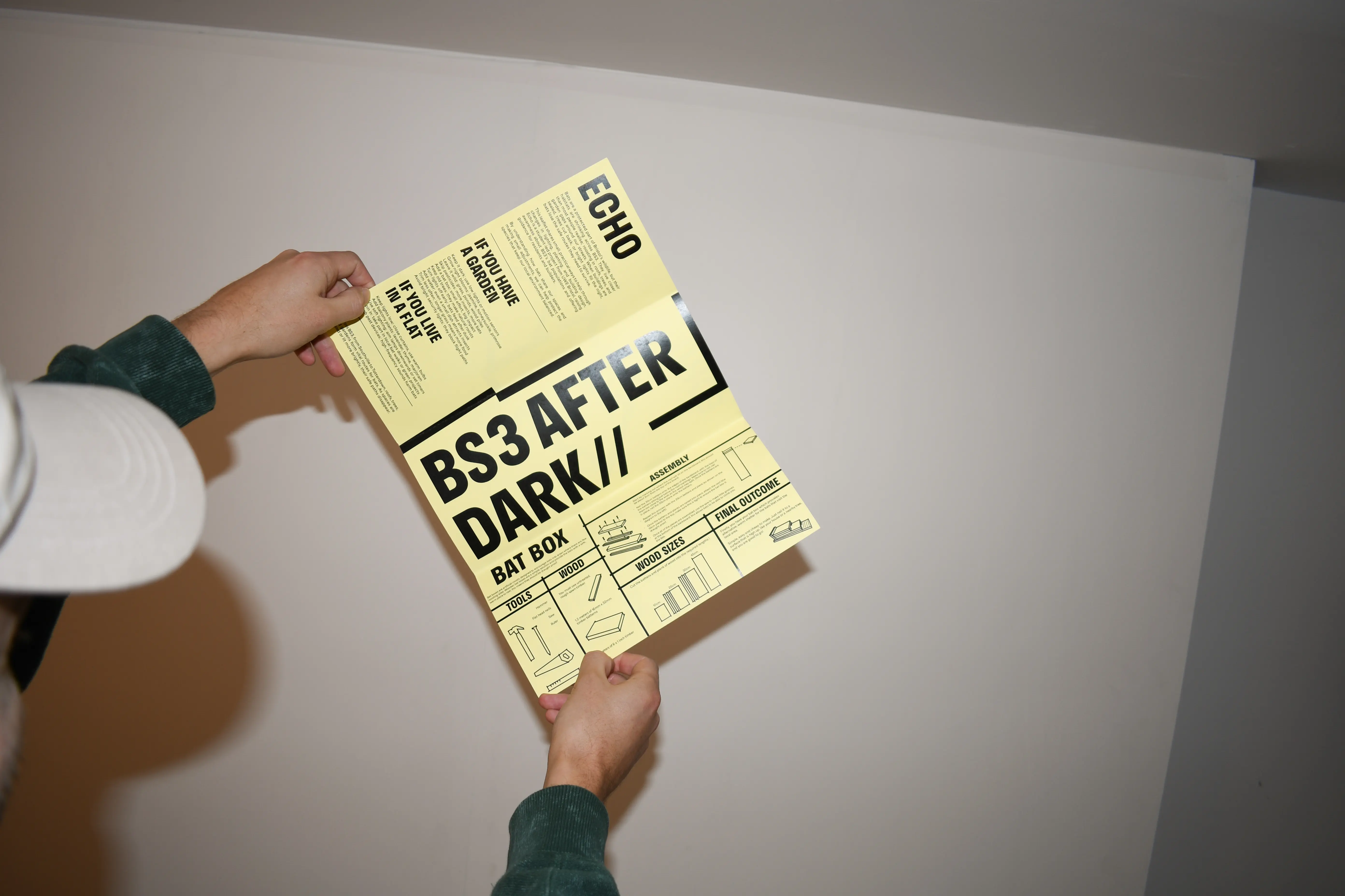
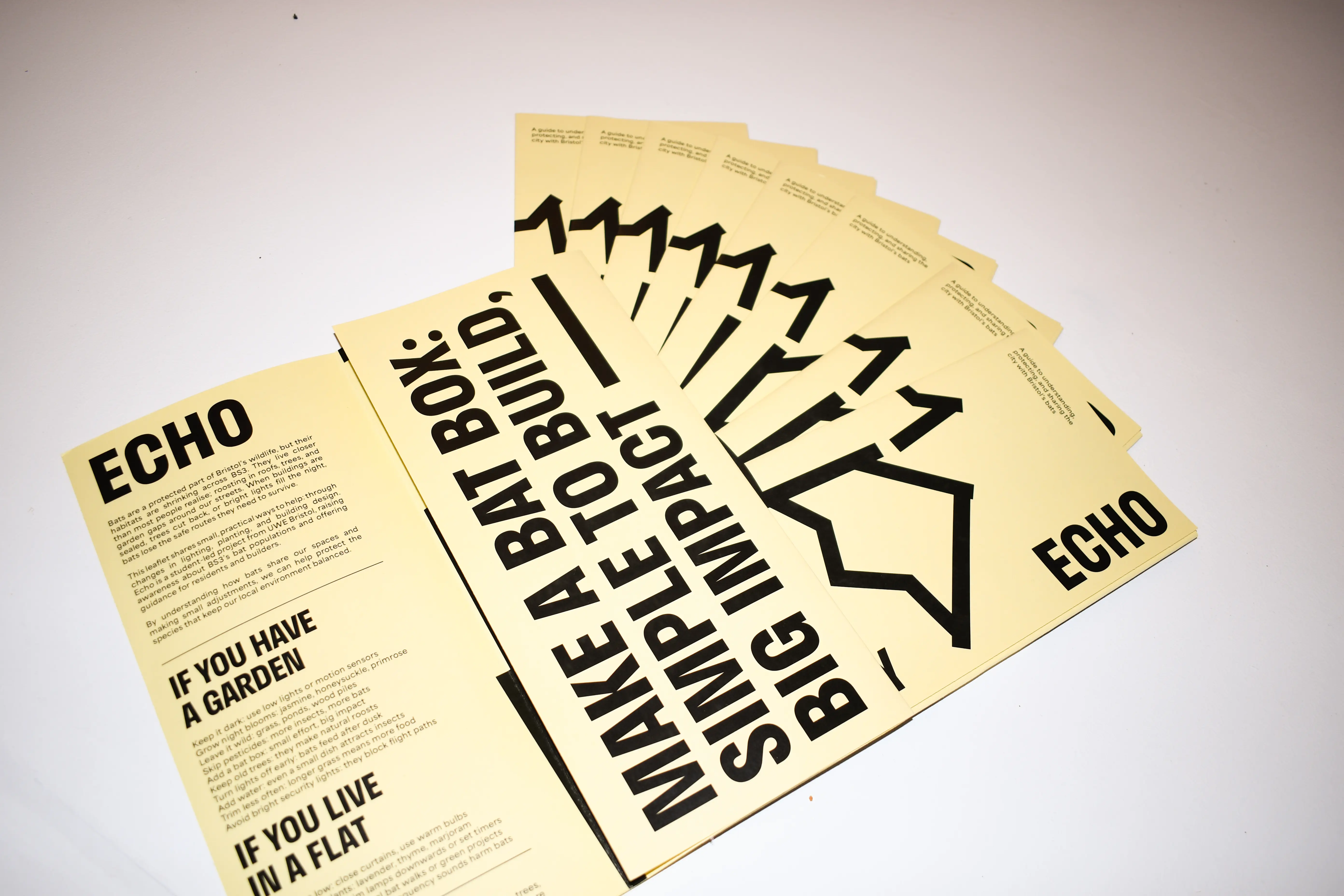
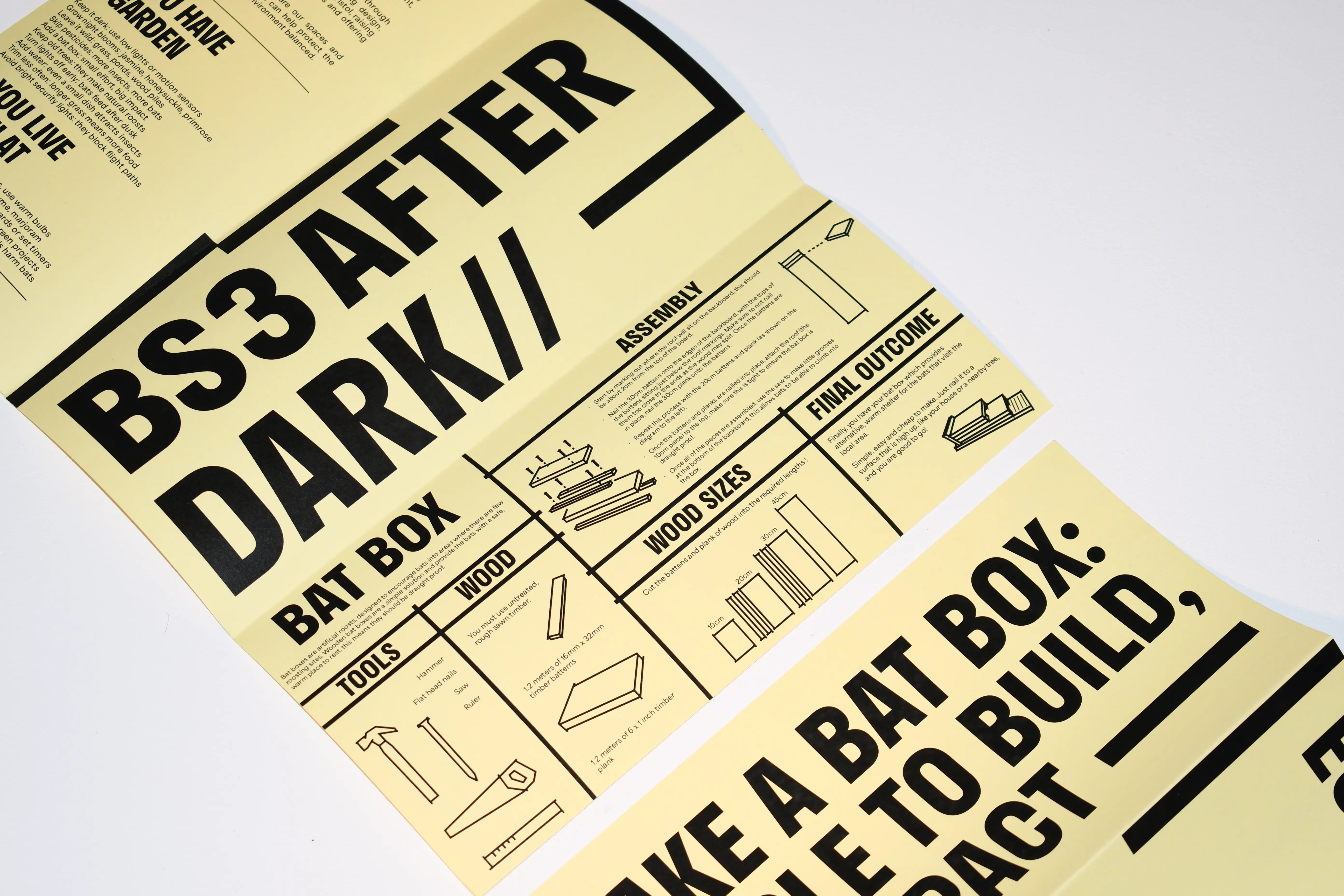
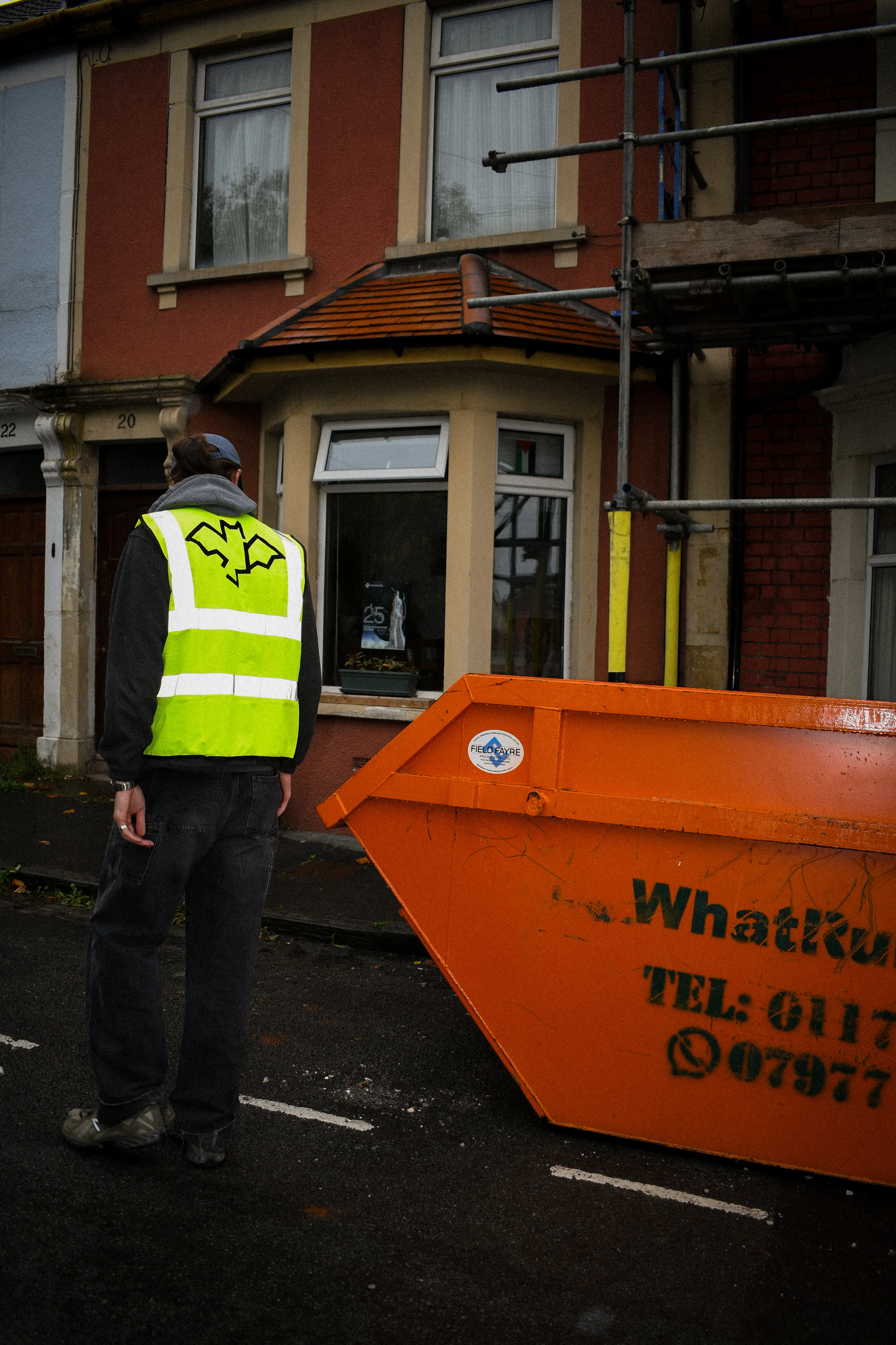
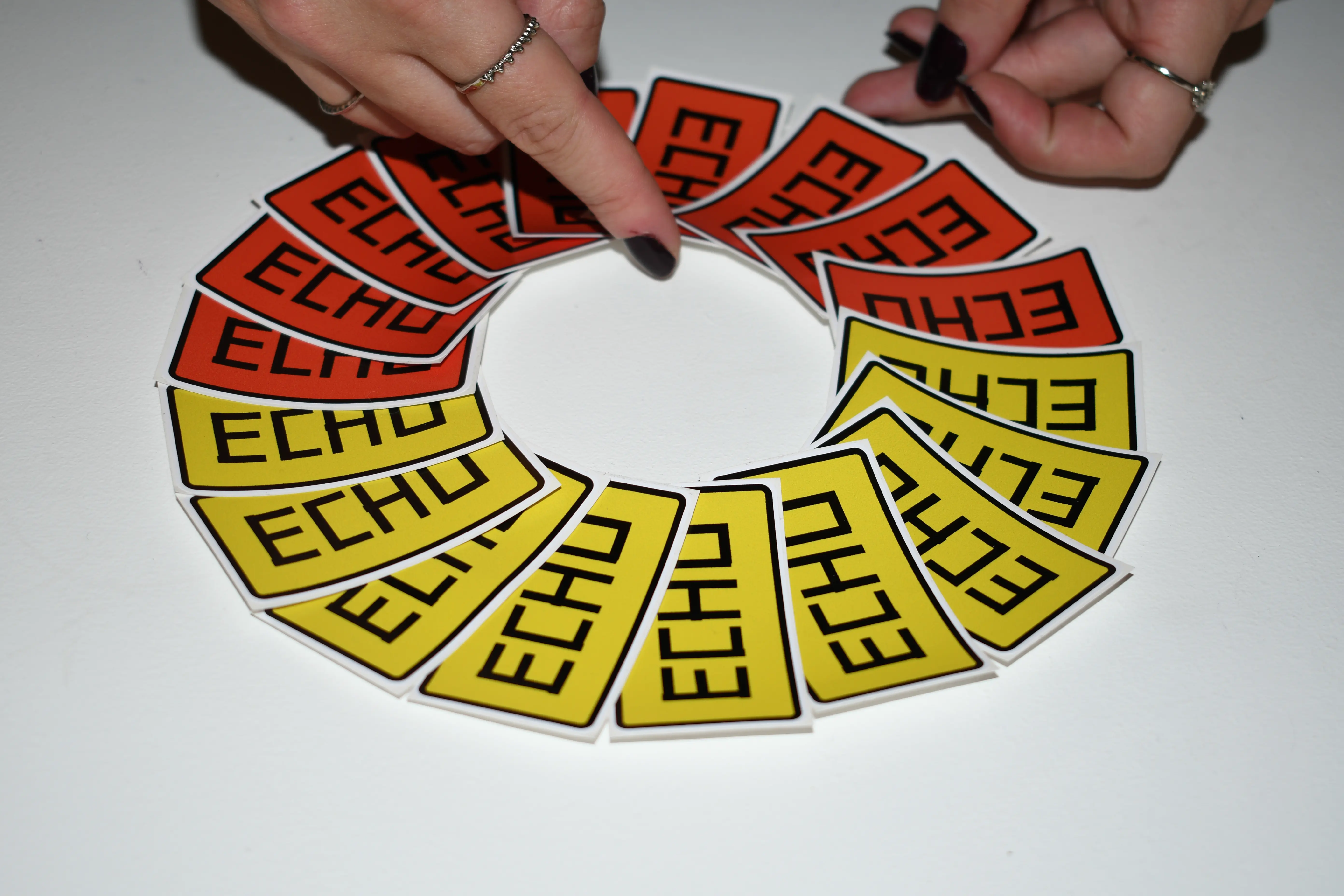
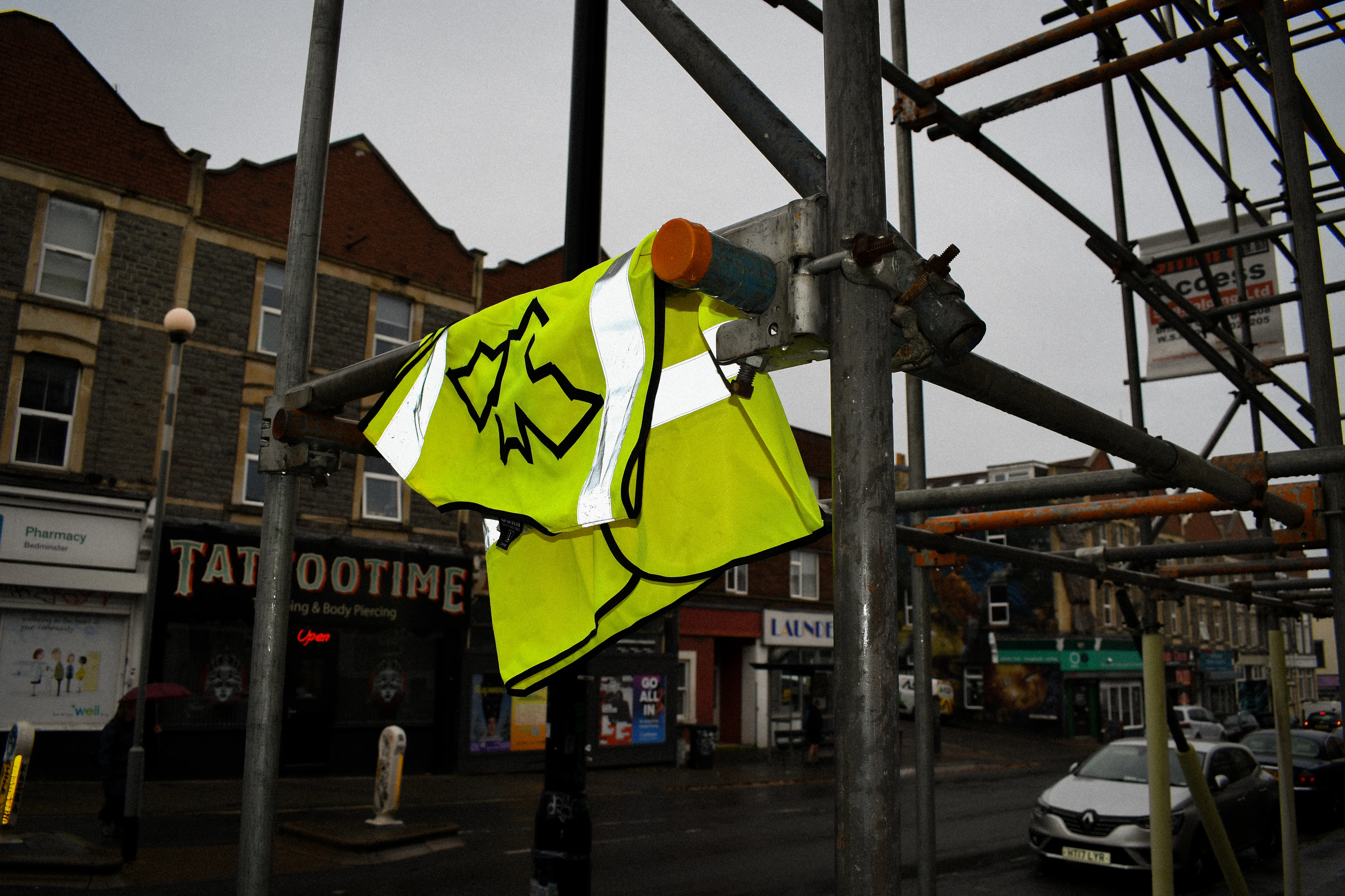
A public-facing campaign to support safe coexistence with bats in Bristol's BS3, where development puts roosts at risk. A builder pack (hi-vis vest, stickers and a quick-reference legal card) and a homeowner pack (a fold-out guide, stickers and a bat box manual) share one visual system of neon yellow and orange, signage-style type and a taped-edge bat mark. Developed with Shantai Mason and Anna Littlewood-Hillsdon.

The Western Trail at Last Publication 02.26

A research-led publication on the Great Western Cattle Trail, which moved cattle and horses from Texas to northern markets in the late 19th century. Built from archival maps, photographs and correspondence with trail historians, organised into five sections across GF Smith coloured stocks, set in PP Kyoto, stitched and perfect bound.

Pocket Gospel Typography 12.24

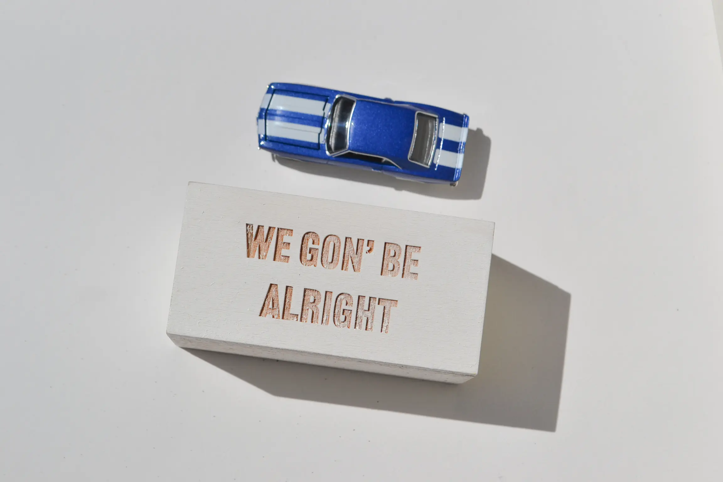
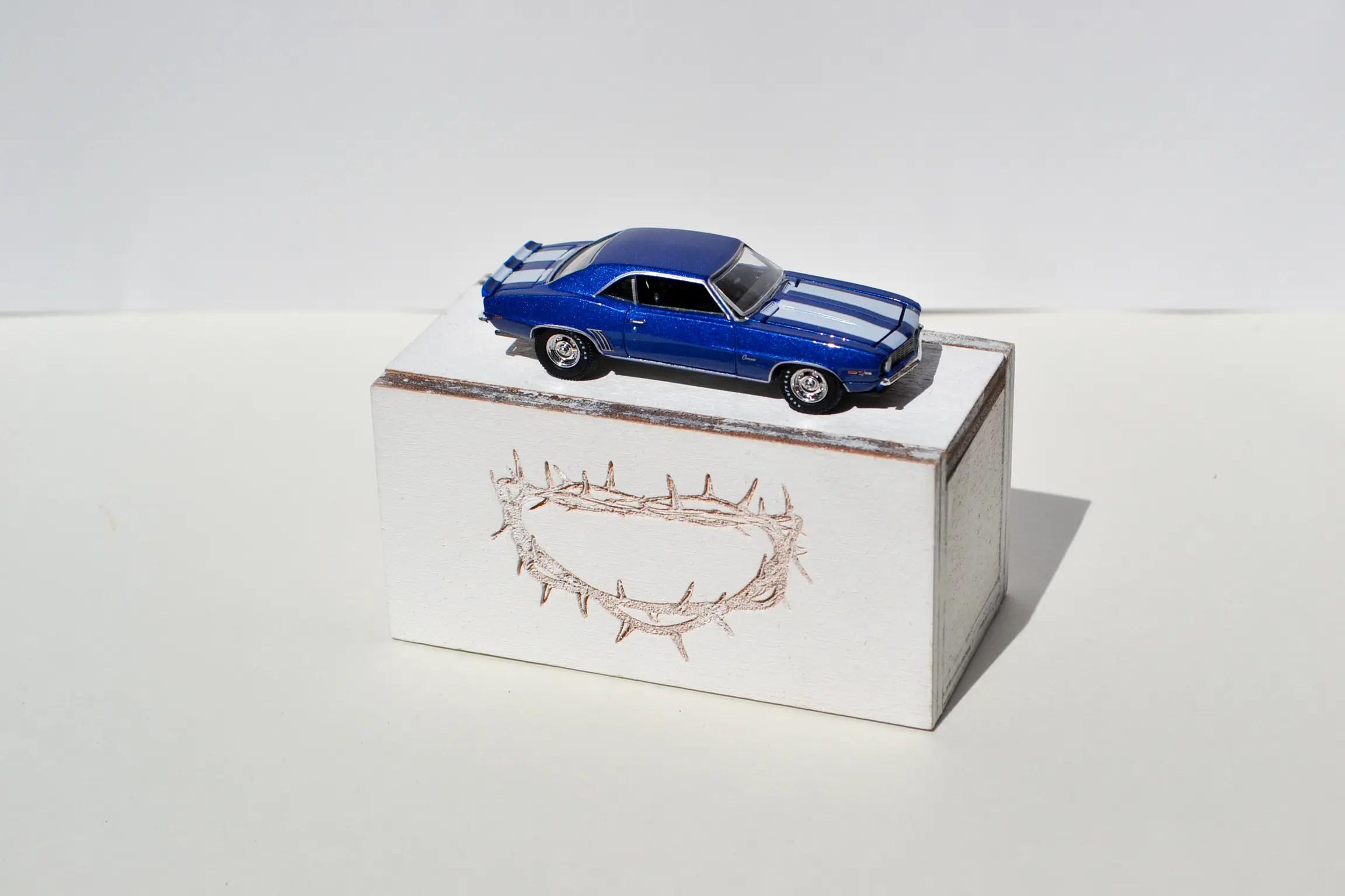
A group response to Kendrick Lamar's “Alright”, exploring the relationship between young Black people and faith. A typographic booklet cross-references lyrics with scripture, paired with a fold-out poster that opens like a church door onto the line “Faith ain't just for Sundays”, and photographs of Bristol churches. The set is completed by a toy car, the one from the music video, on a laser-cut plinth.

Lemur Loom Web Archive 10.24

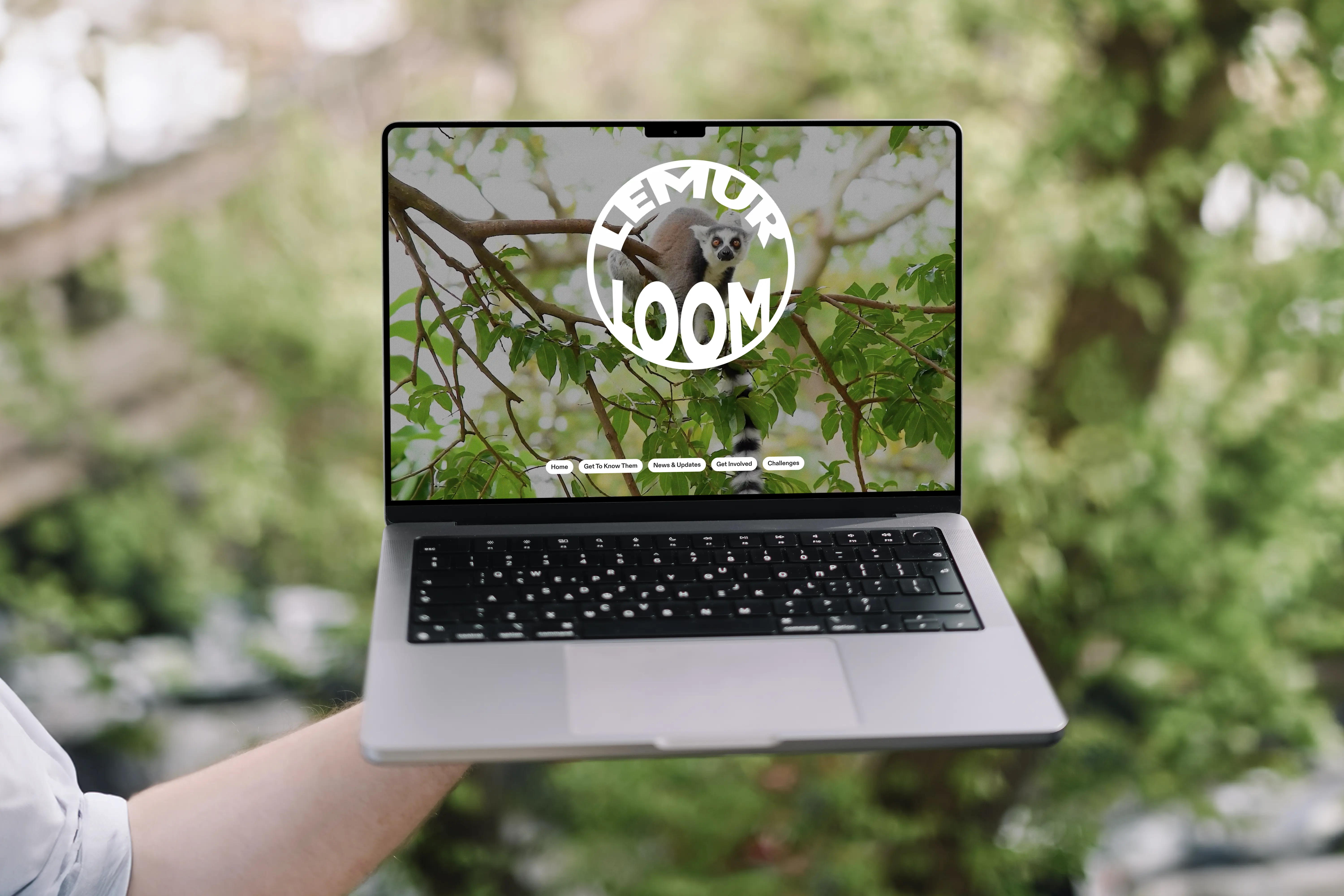
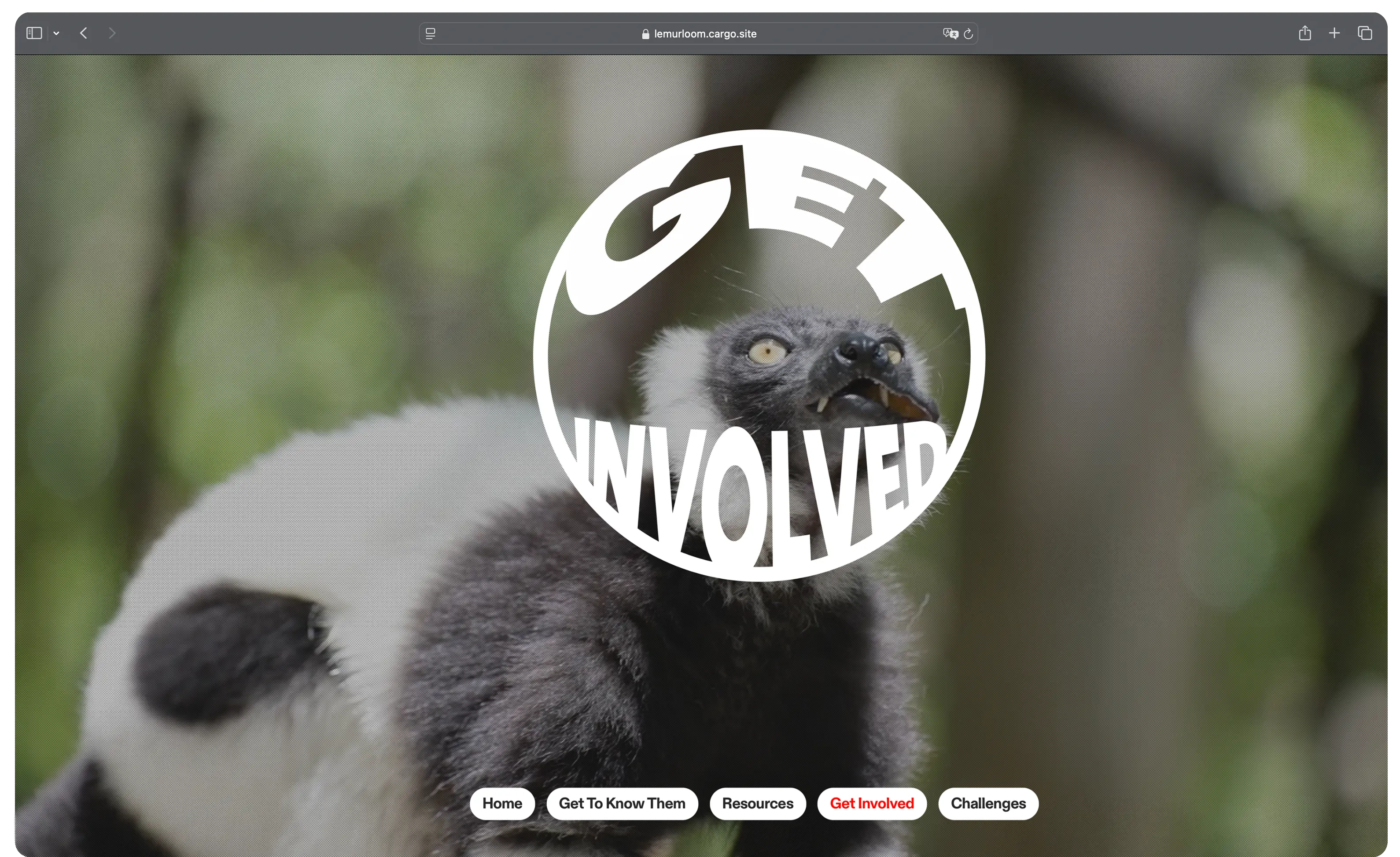
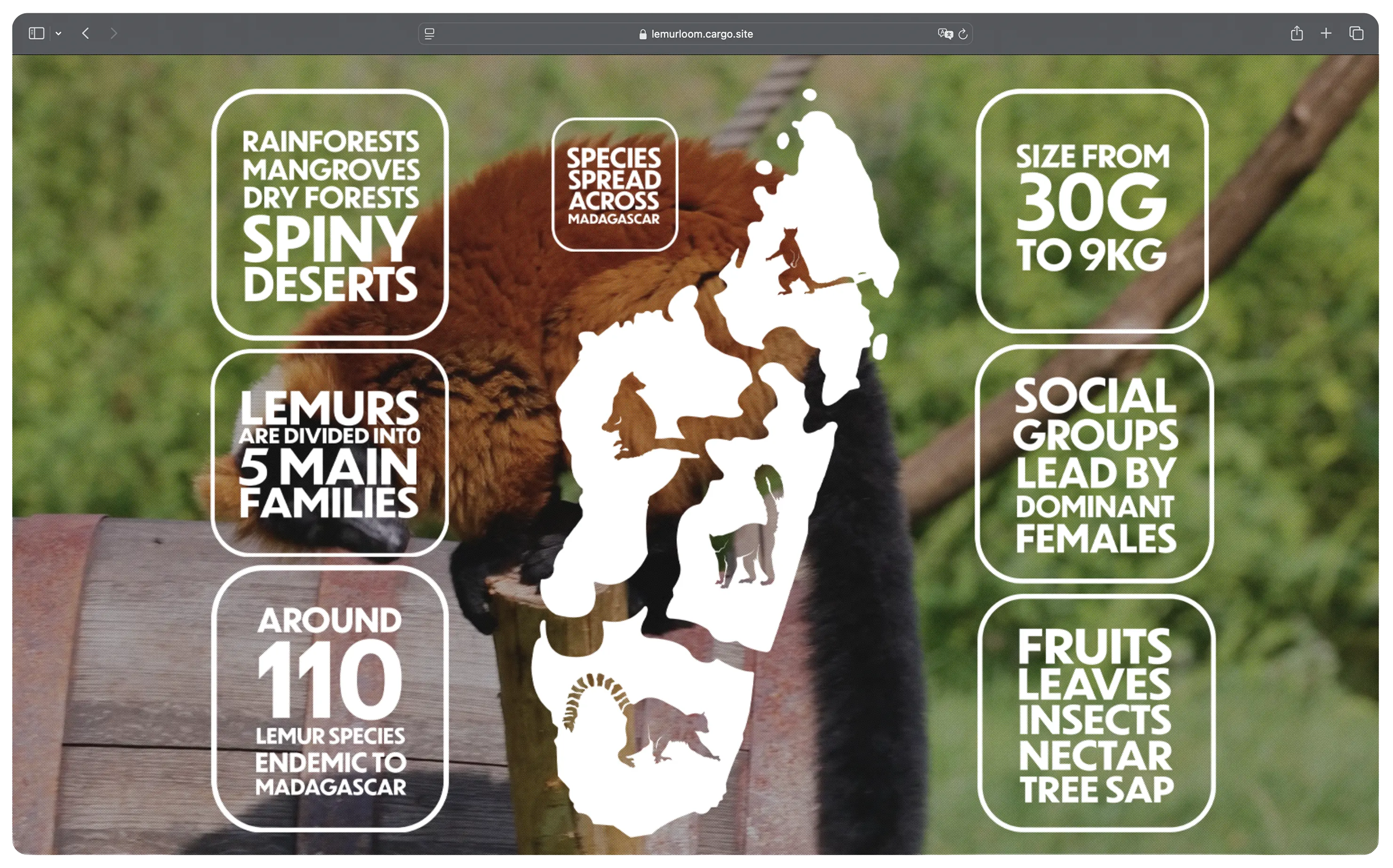
An educational website for lemur conservation, made for the Creative Conscience brief. It gathers facts, endangered status, ways to help and a regularly updated resources hub, drawing on conversations with lemur researchers. Built in Cargo with custom icons and infographics, a looping lemur film behind each section, and A6 printed guides for visitors at the exhibition.